Role: Creative Director & Founder
Year: September 2024 – Ongoing
Project Scope
Brand Strategy · Visual Identity · Packaging Design · Product Photography (Nikon) · Website Design (Shopify) · Copywriting · Print & Digital Design · Art Direction · Social Media Design
About
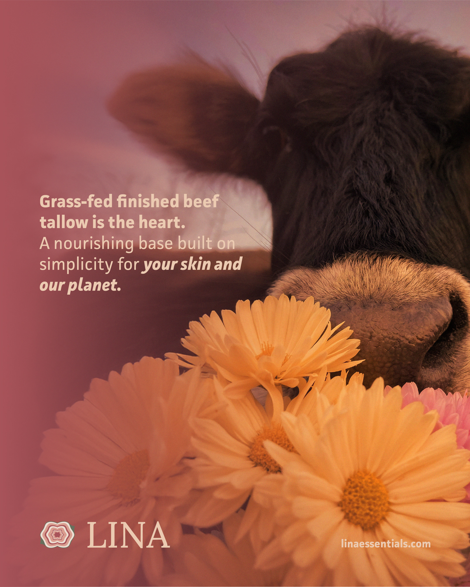
I started LINA Essentials after discovering that no tallow balm on the market had ever been made with Rose Otto — one of the world's most treasured essential oils, drawn from thousands of handpicked Bulgarian rose petals.
That gap was the beginning. The tallow market was growing, but most brands felt raw, repetitive, and unrefined — heavy on the farm aesthetic, light on identity. I wanted something different: personal, one of a kind, and elevated without being out of reach.
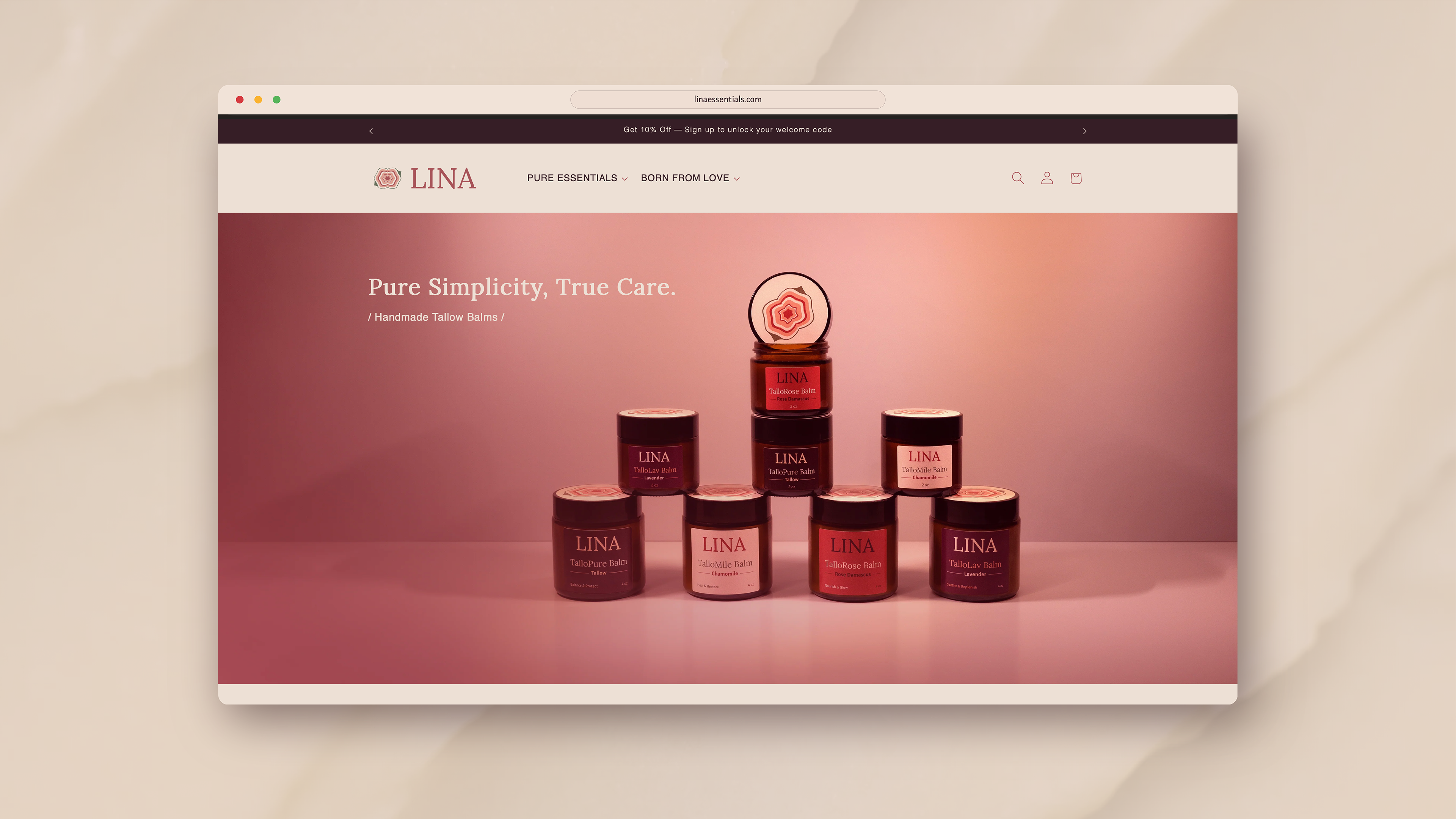
Starting from a blank canvas and a single idea, I built a complete natural skincare brand — from strategy and identity to packaging, photography, and a fully functioning e-commerce website.
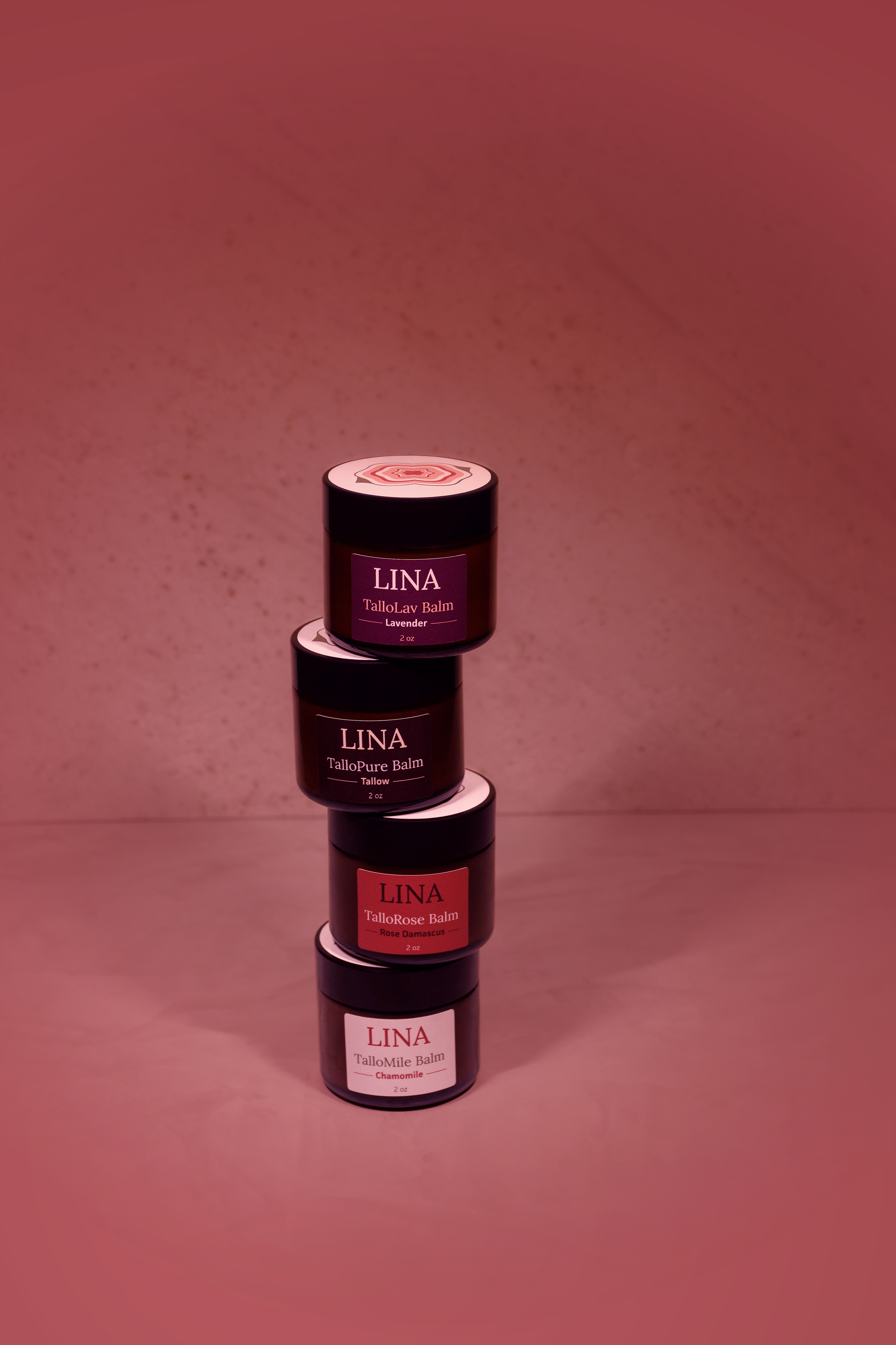
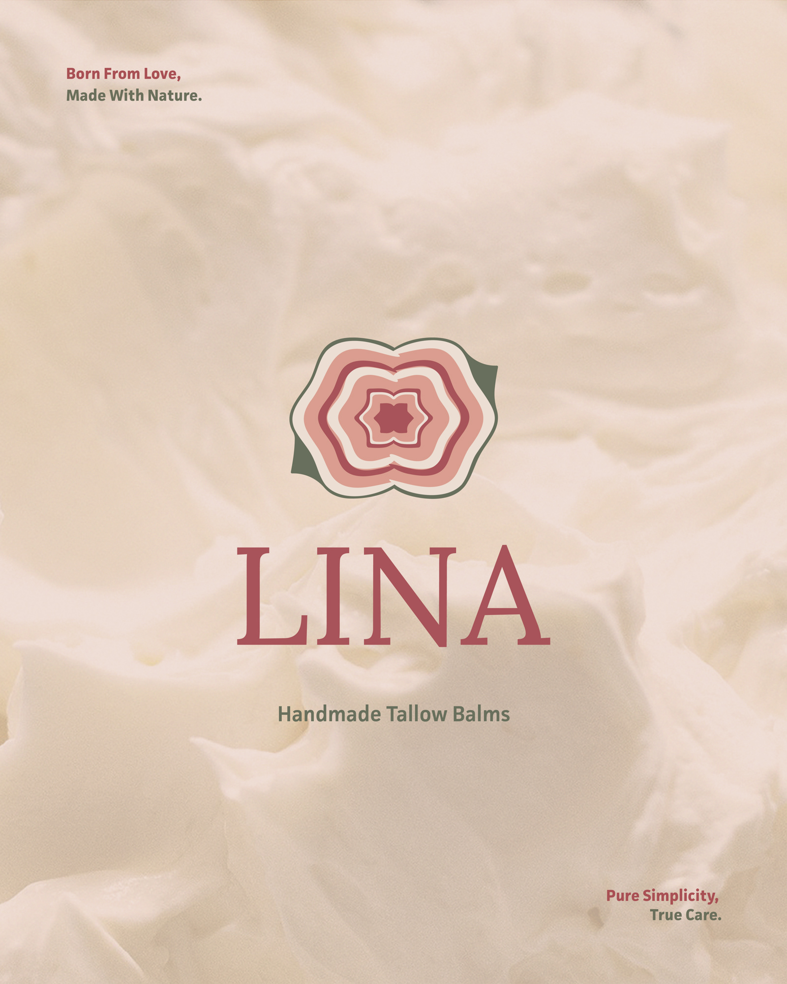
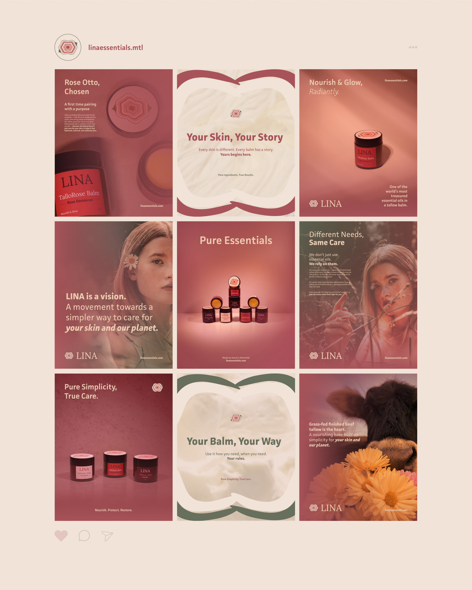
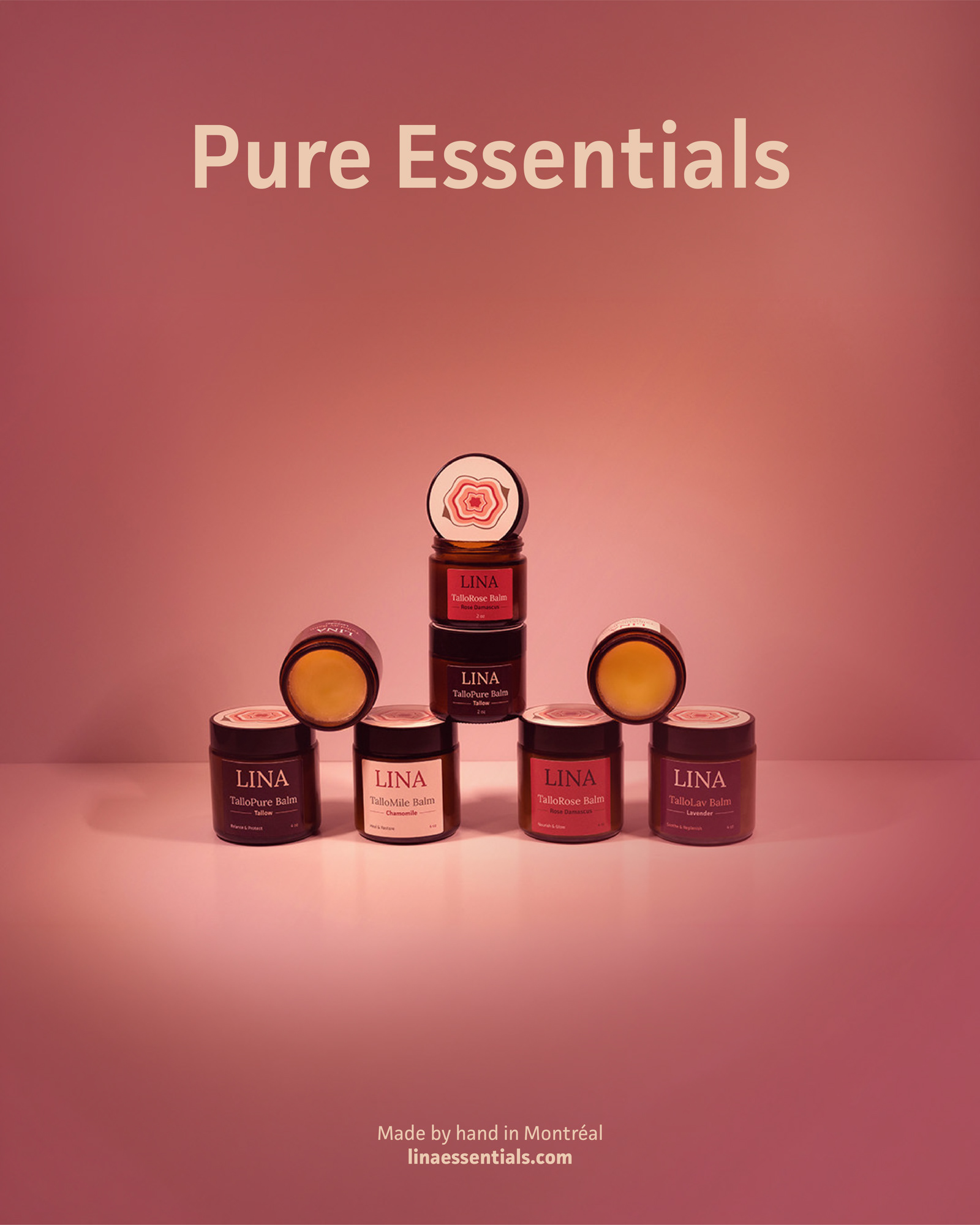
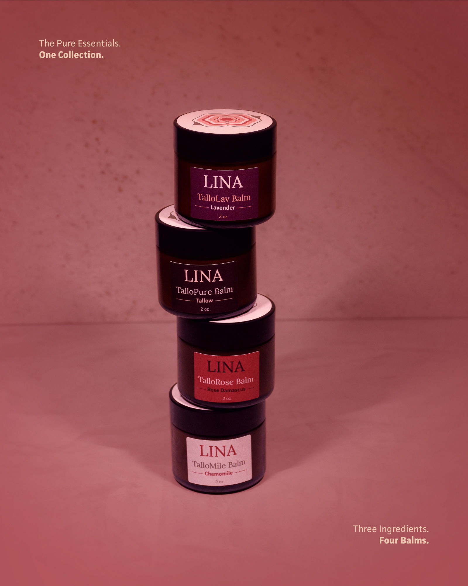
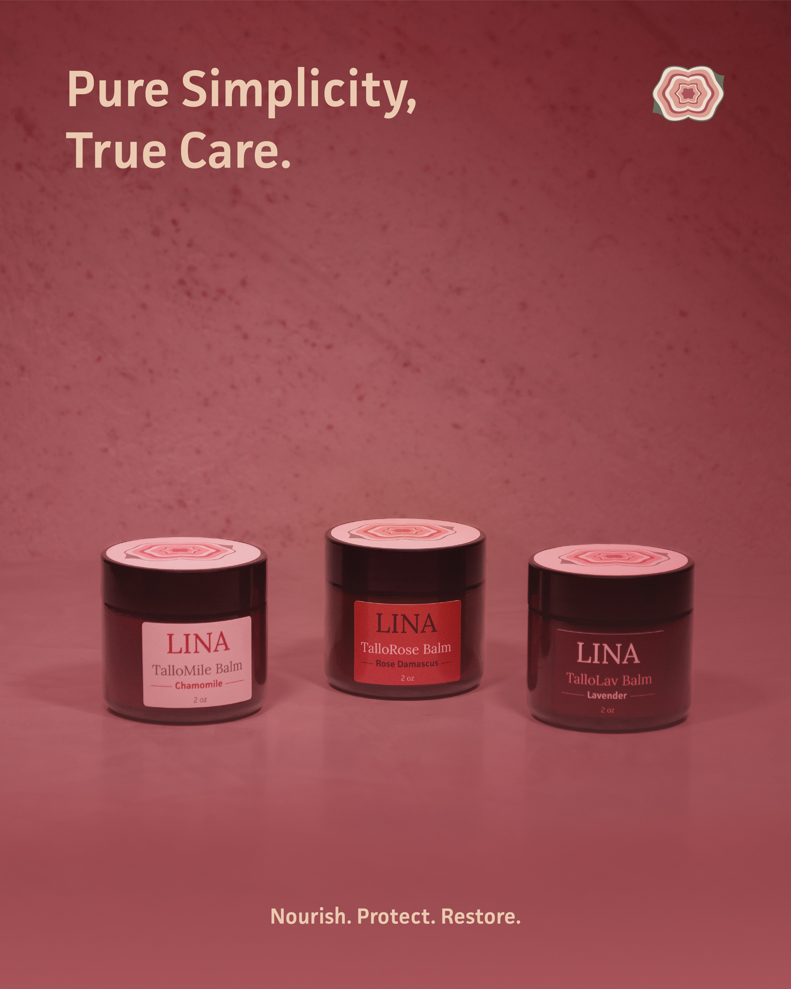
And this is LINA — a tallow skincare brand born from love and handmade with nature, with the Pure Essentials collection at its heart: four balms, each with its own story and purpose.
Naming the Brand
I wanted a name that felt soft, short, elegant, memorable, and personal. LINA comes from my best friend Tsvetelina — a subtle but meaningful nod to the story that started it all, when she began rendering tallow in her kitchen for her baby. It also carries a natural elegance common to Slavic names ending in -lina, and had the perfect sound and flexibility for a clean skincare brand.
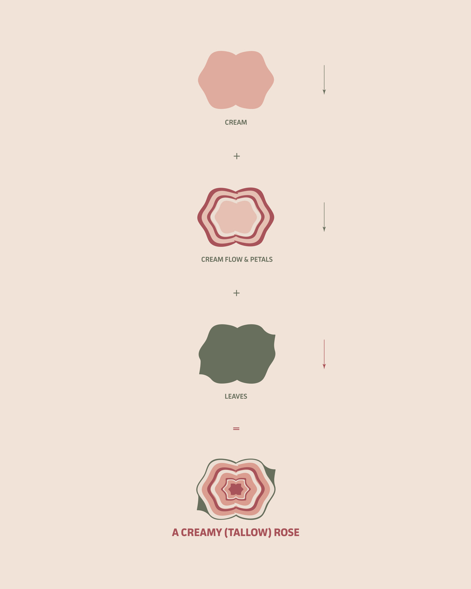
The Symbol "A Creamy Rose"
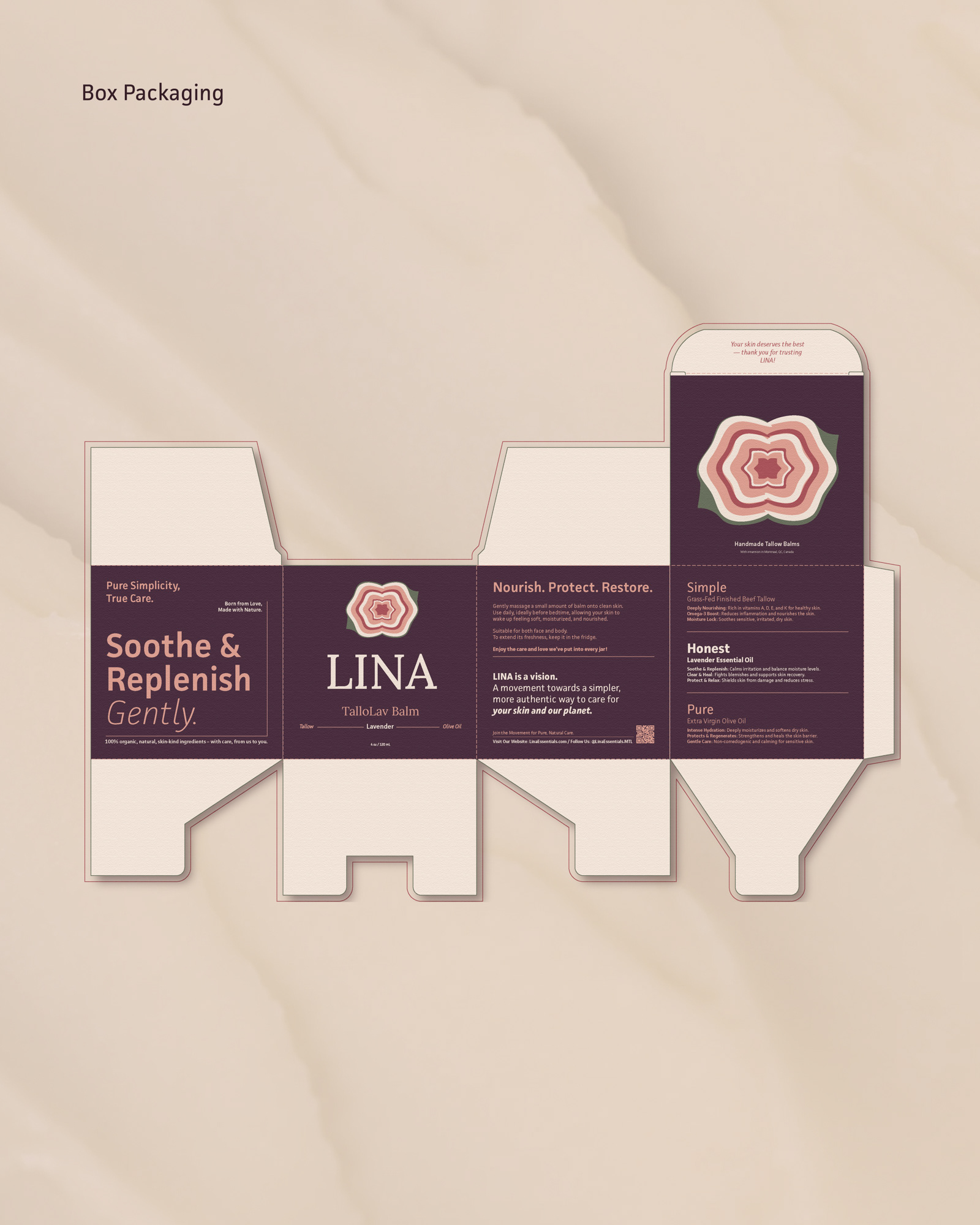
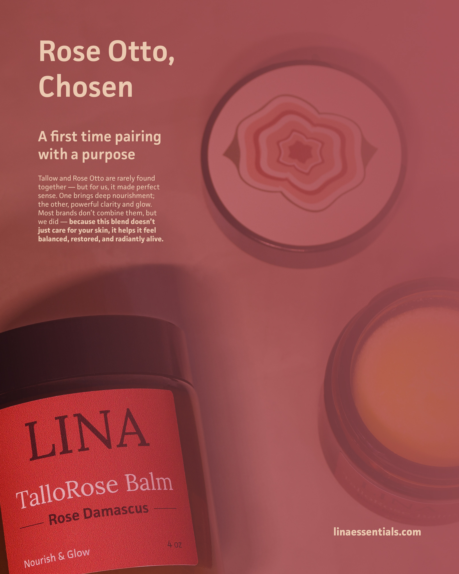
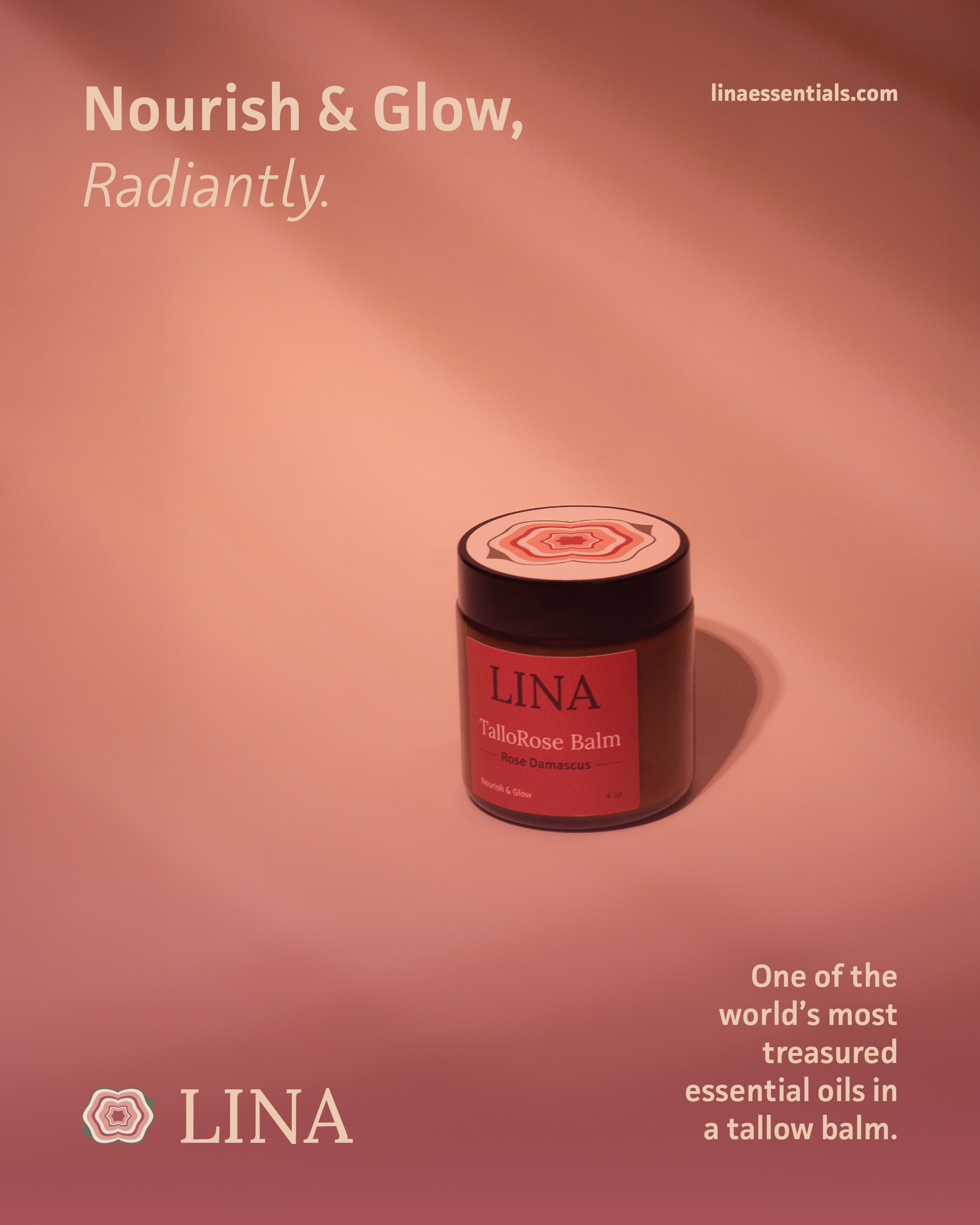
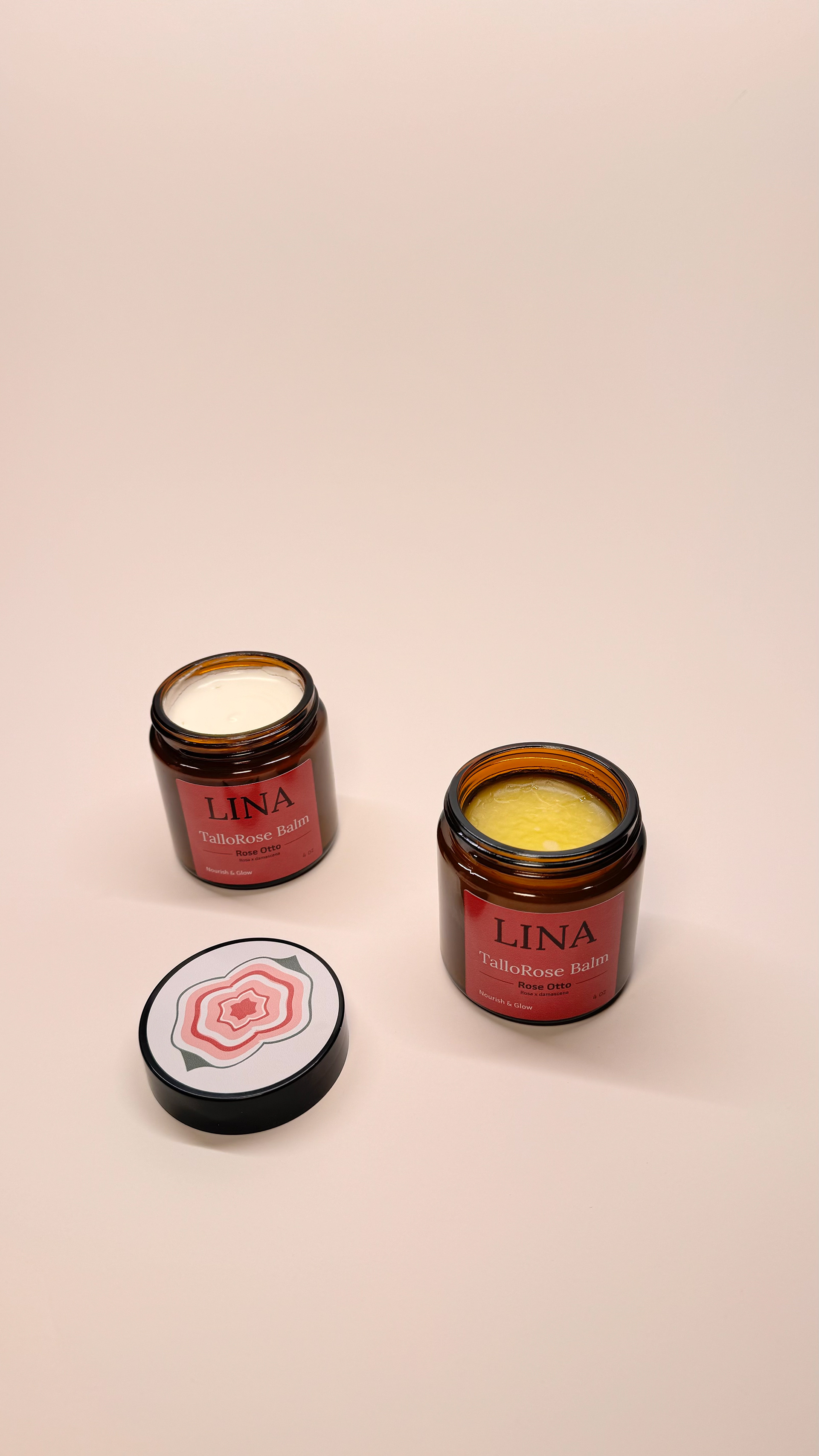
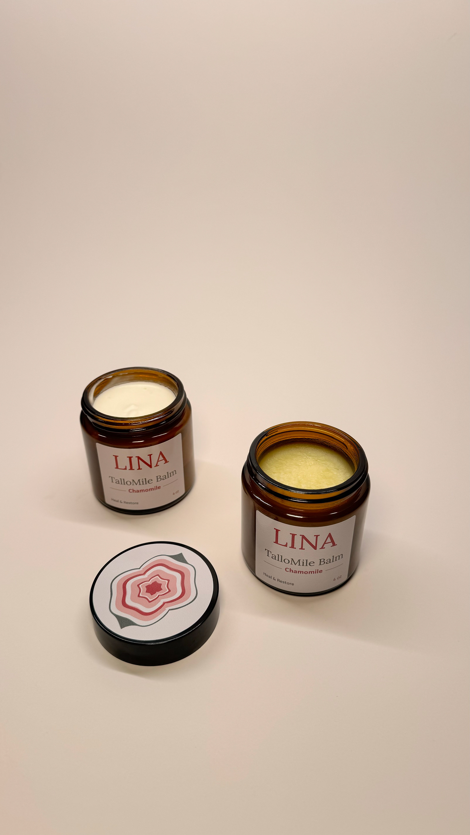
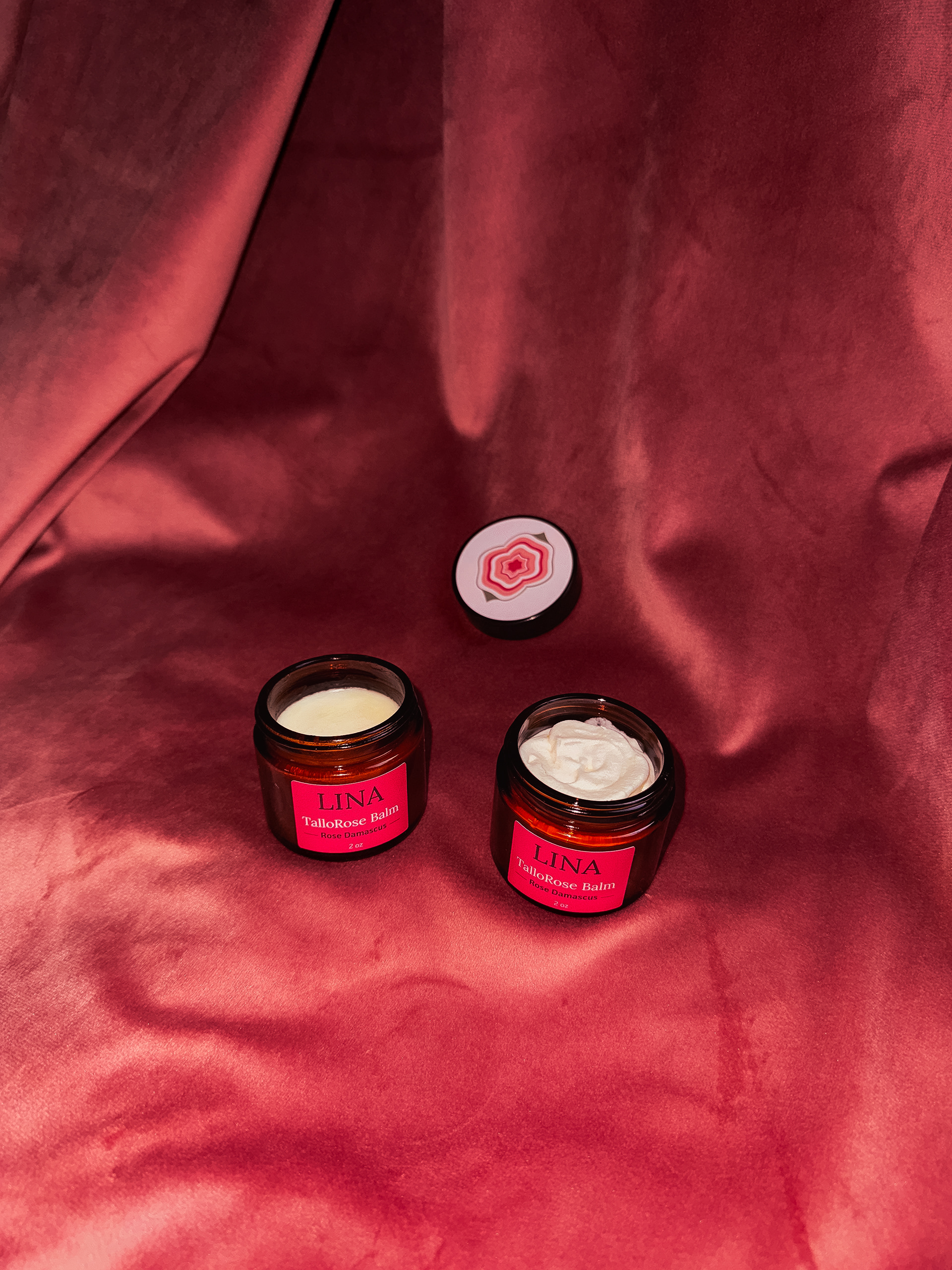
LINA's hero product combines two rare elements: grass-fed beef tallow and Rose Otto. I wanted the symbol to reflect that distinctive blend. The resulting mark — a creamy rose — merges the softness and richness of cream with the layered flow of rose petals, anchored by leafy accents that ground it in nature. The organic layering suggests movement, moisture, and depth — qualities you feel the moment you open the jar.
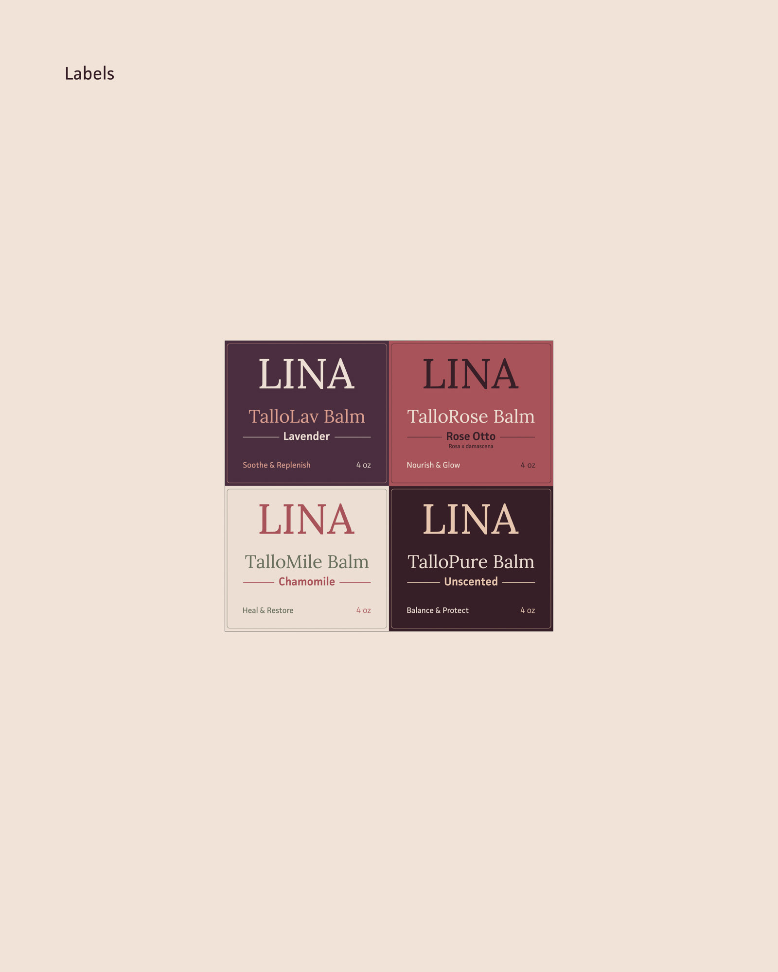
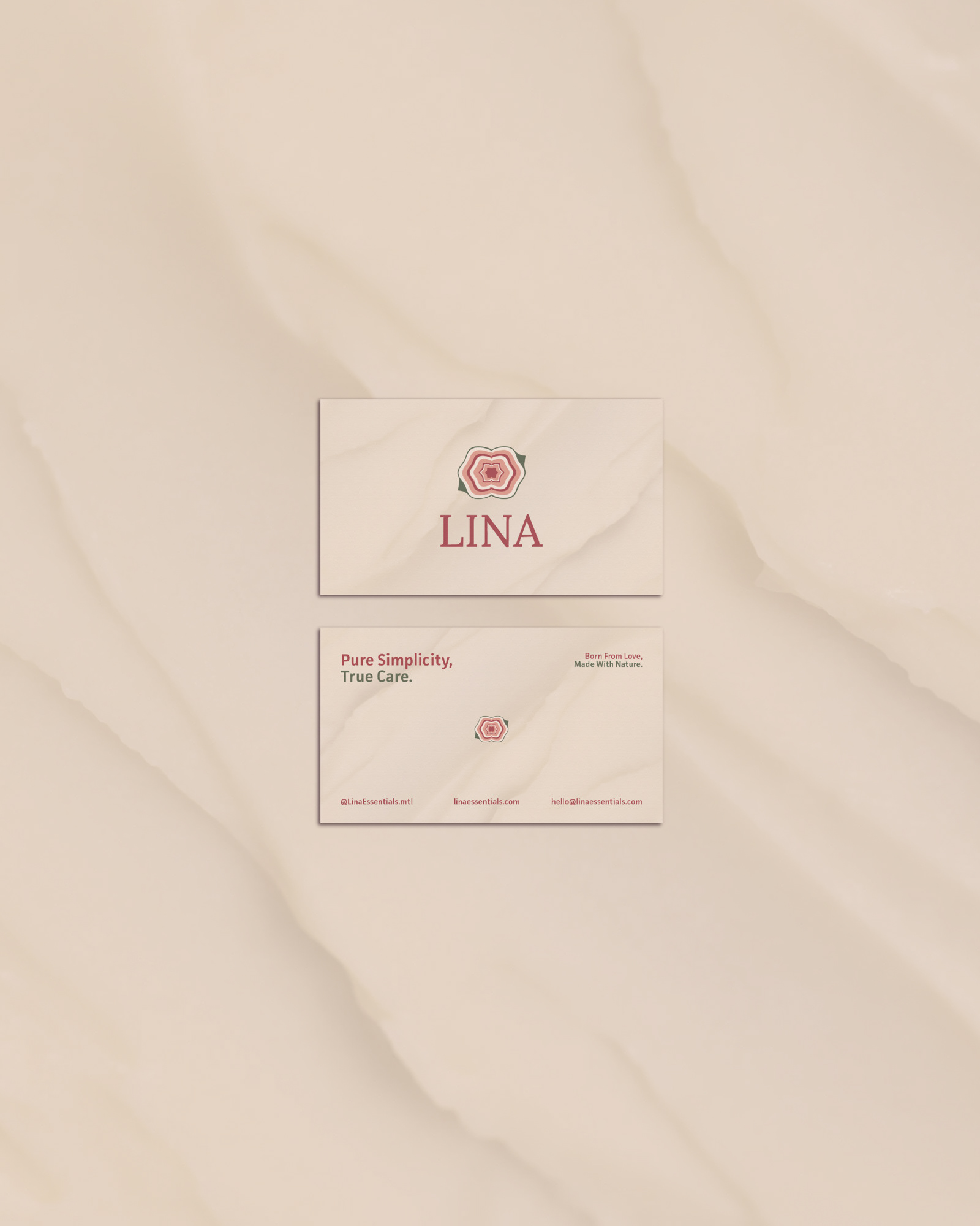
Product Labels & Naming System
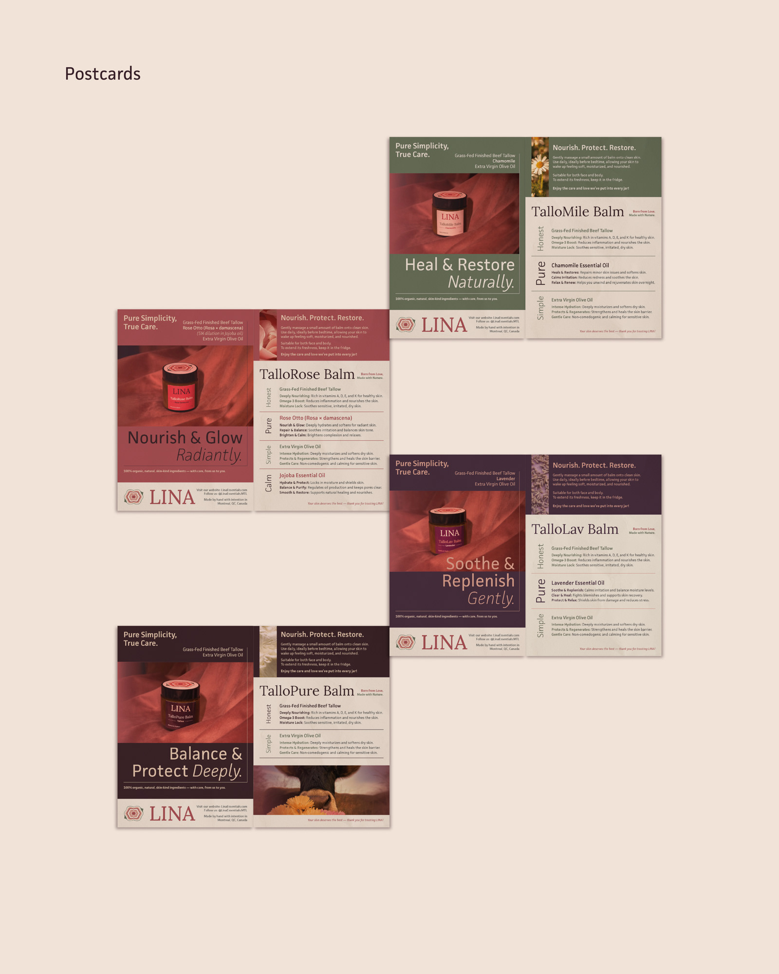
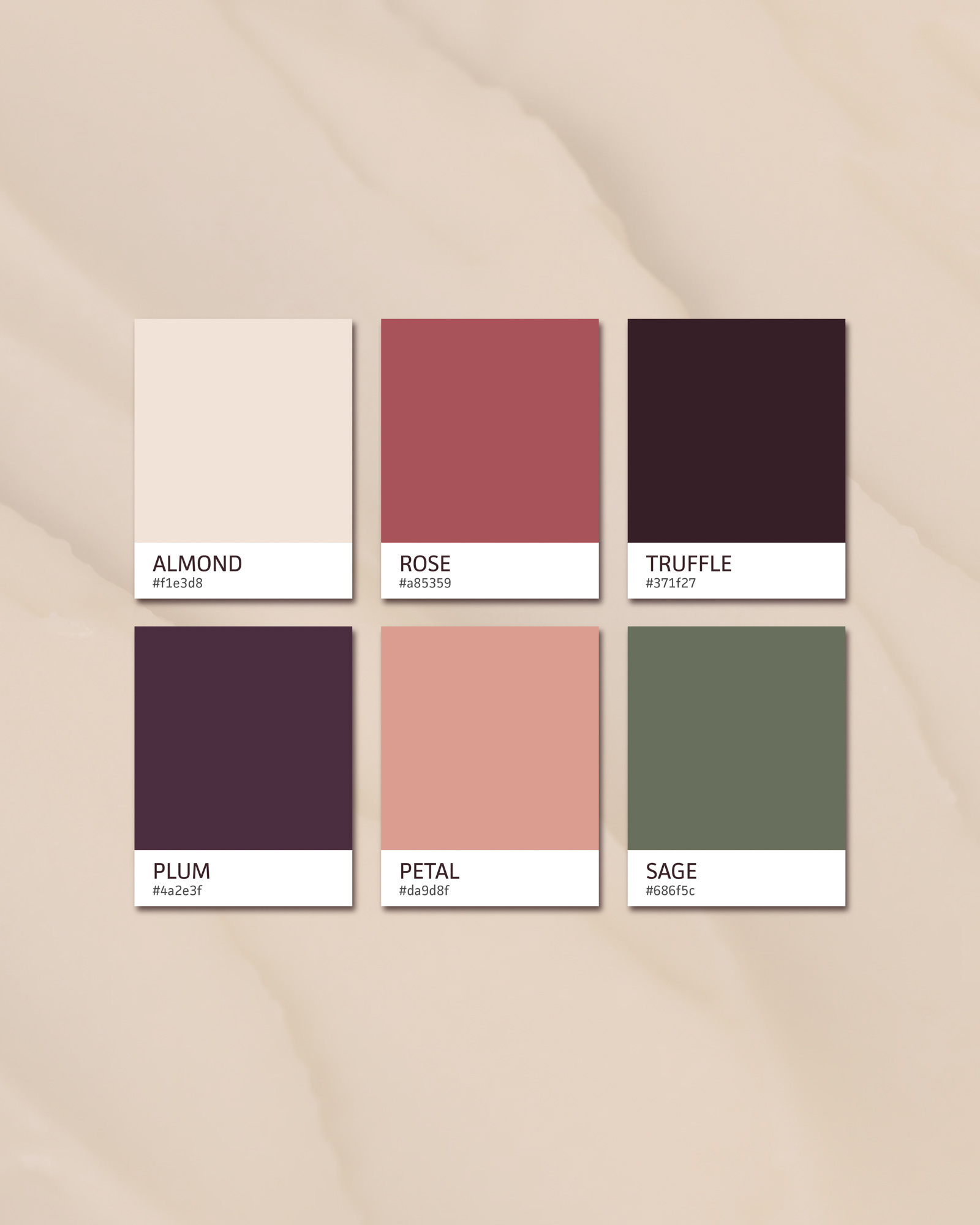
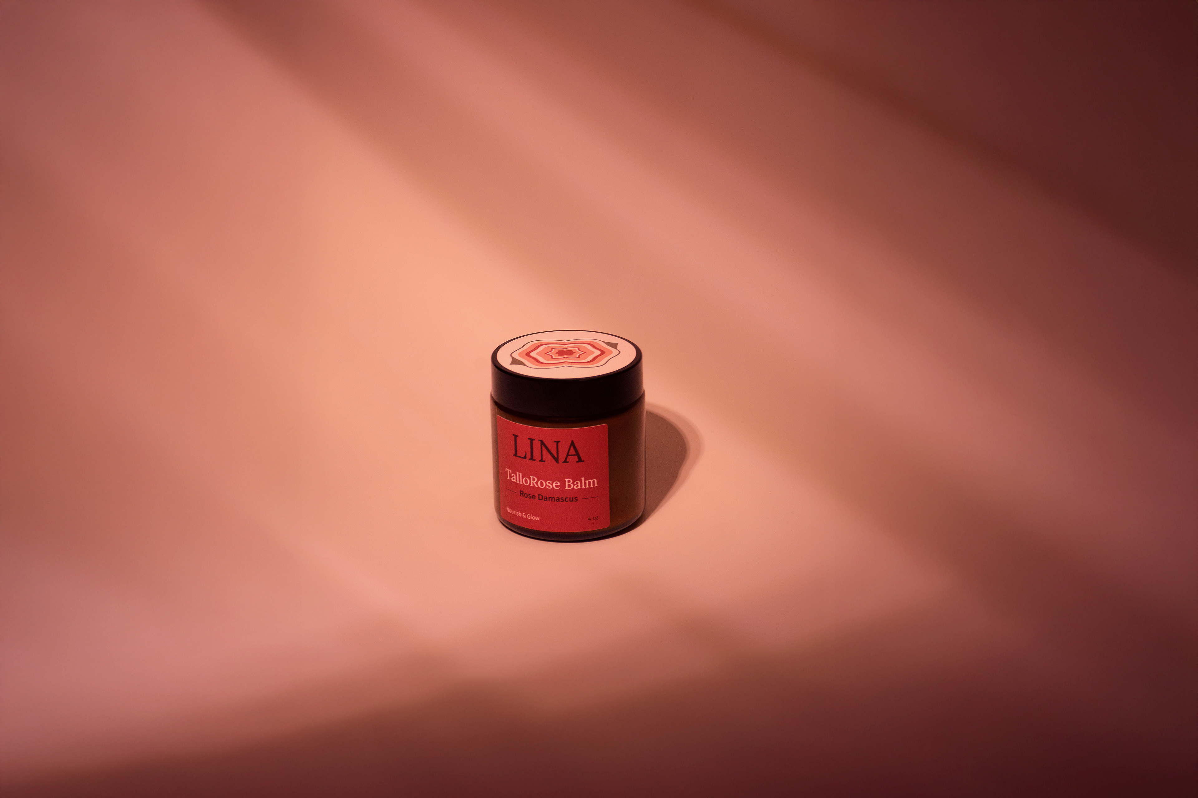
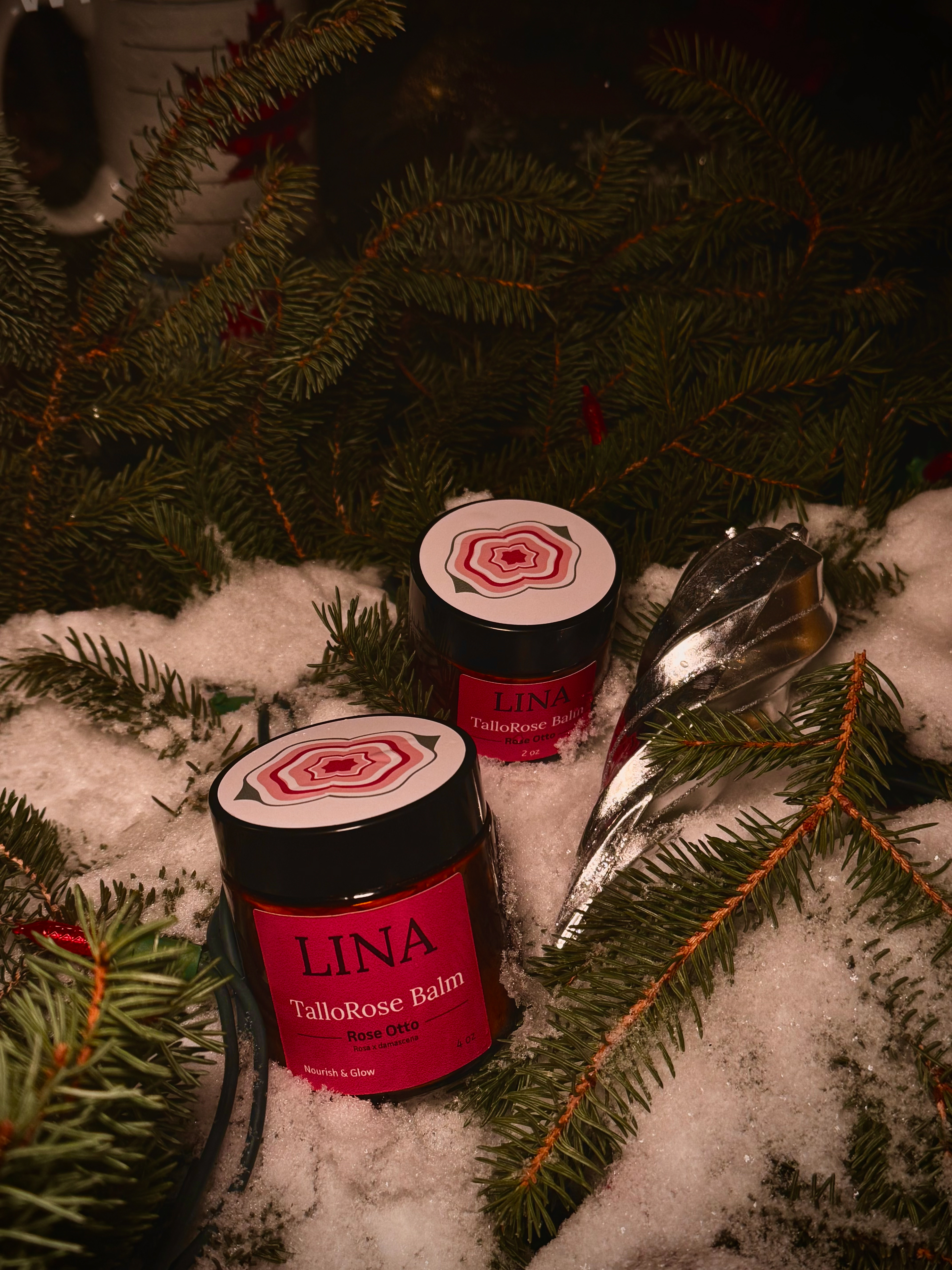
Each balm name was built by combining "Tallo" with its key botanical: TalloMile, TalloLav, TalloRose, TalloPure. A simple system that keeps the line unified while giving each product its own identity. To reinforce that, each balm has its own color palette — soft green for chamomile's gentleness, deep plum for lavender's calm, warm pink for rose — carried consistently across labels and design. Each label also includes a short tagline capturing the balm's emotional and functional purpose at a glance.
Art Direction & Photography
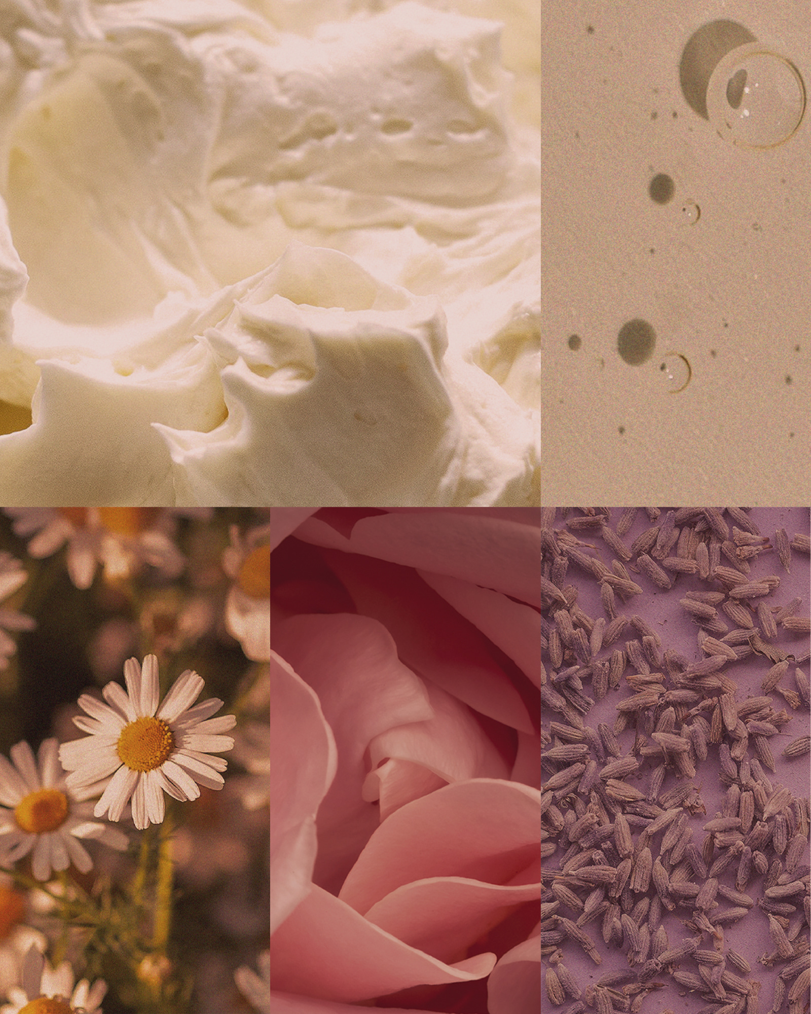
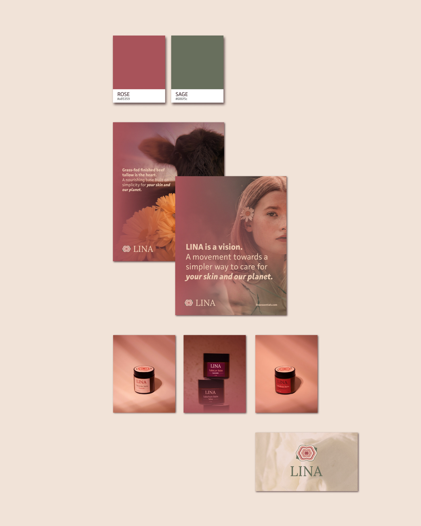
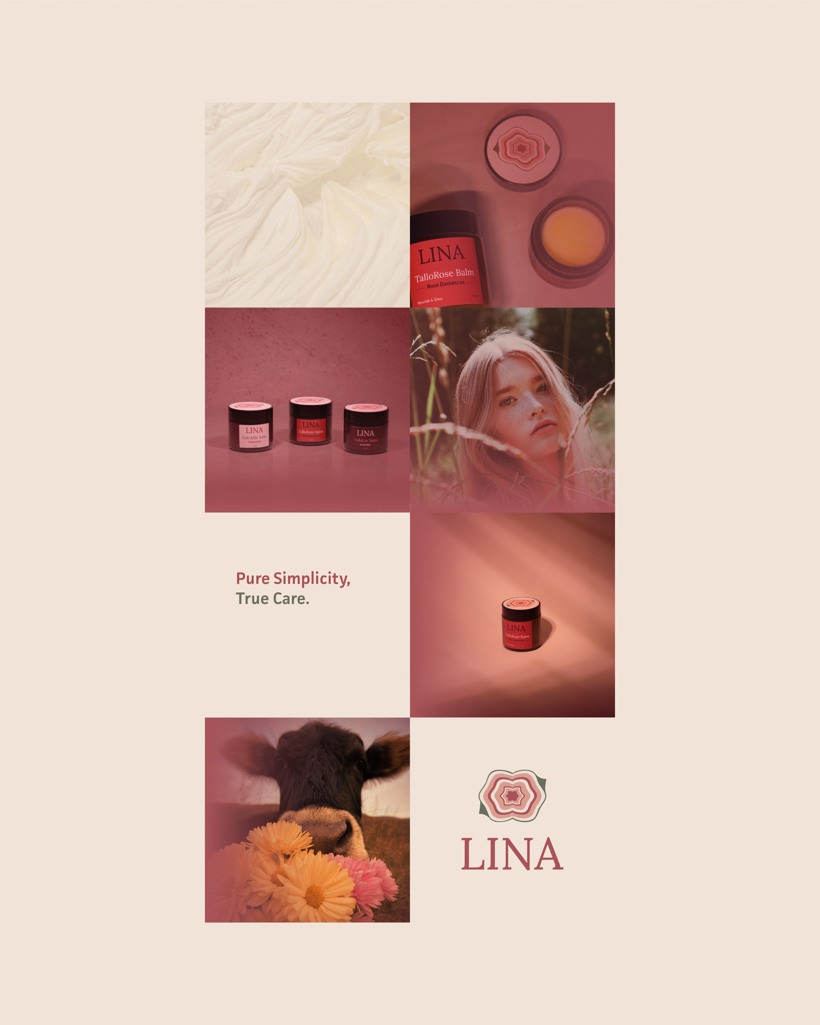
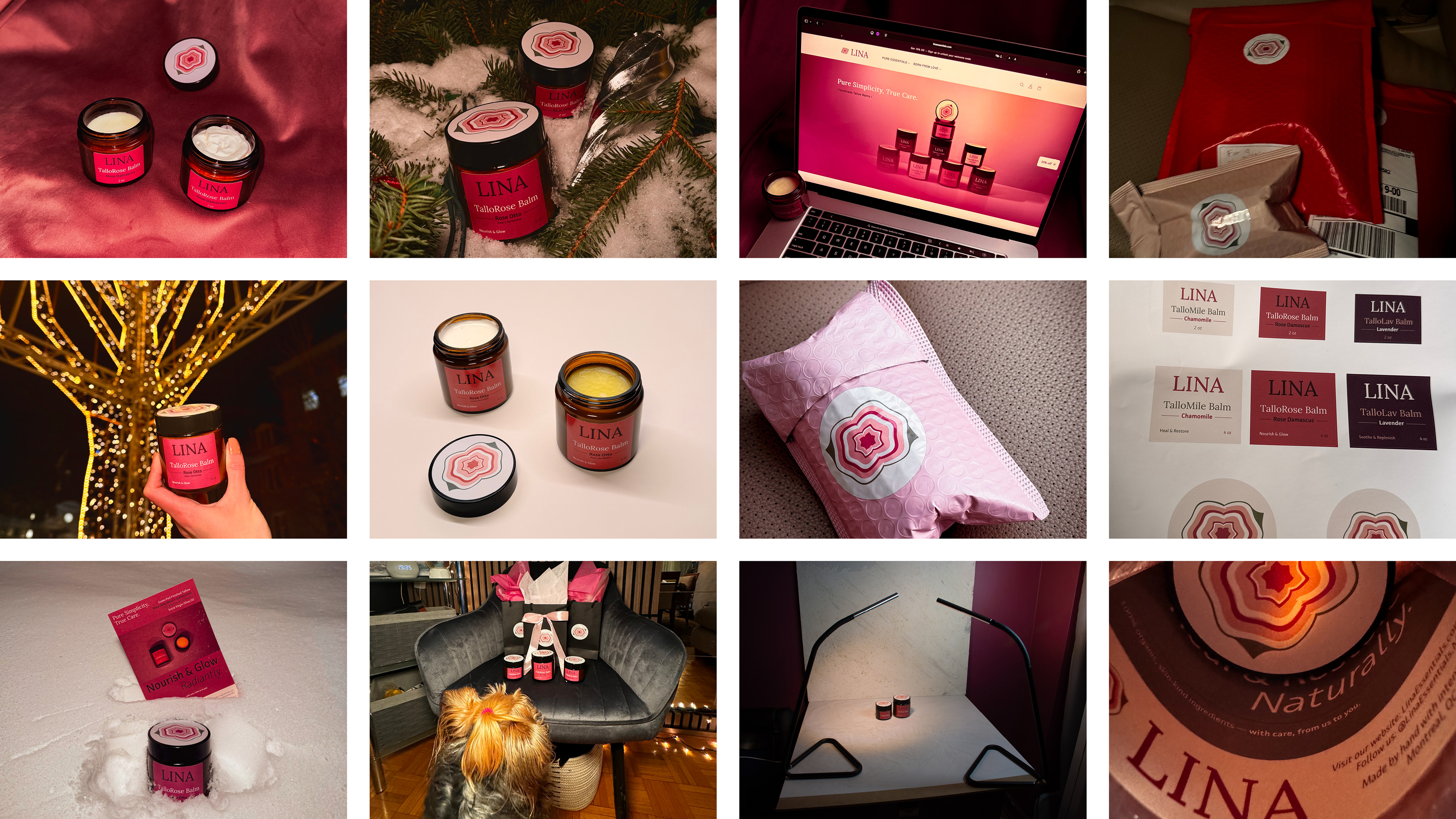
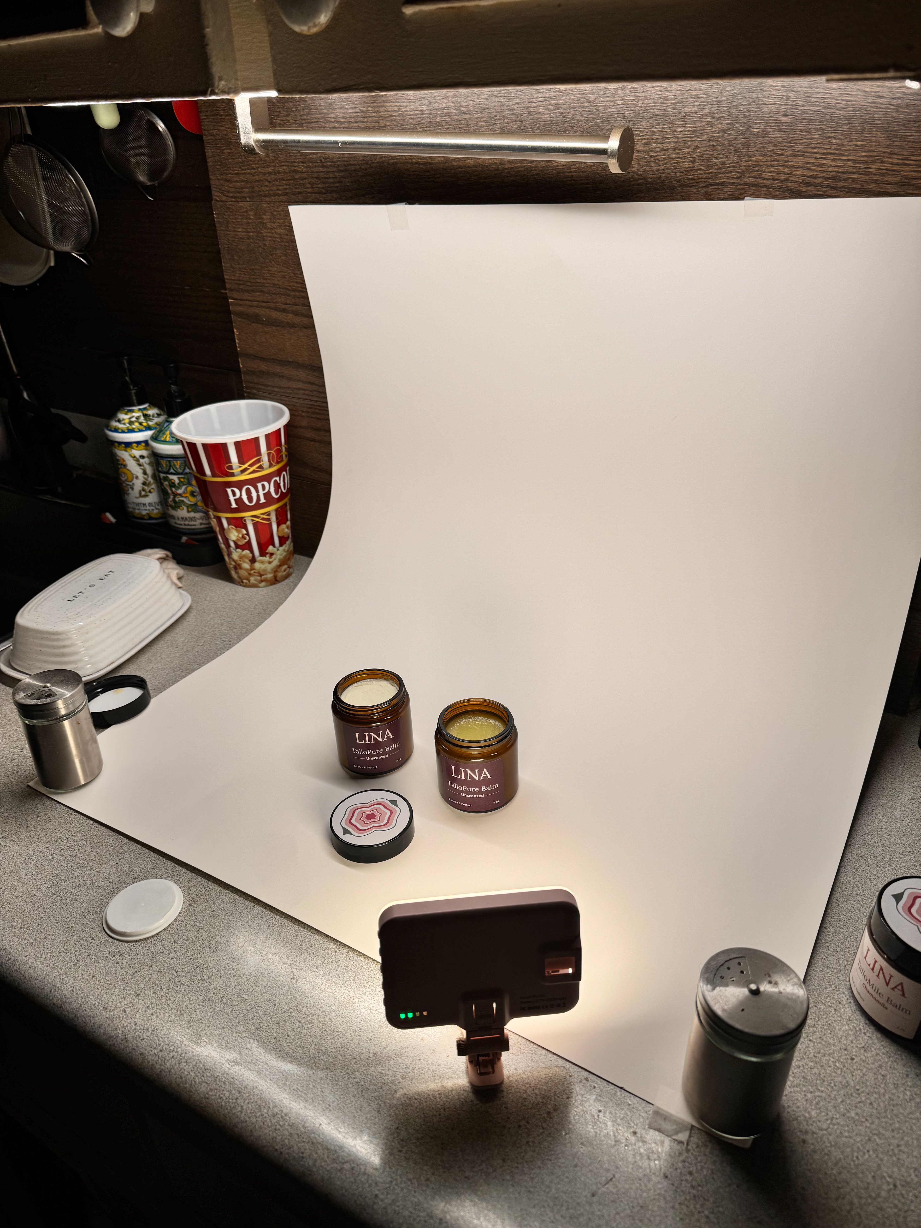
Every graphic was designed to feel like an extension of the brand — consistent in tone, color, and message. The photography was shot entirely at home with a Nikon D7200, a backdrop, and home lighting. I wanted the images to feel mysterious and warm, true to LINA's palette, so I spent a lot of time in post-editing to get there. No studio, no professional setup — just a clear vision of what the brand needed to look like.


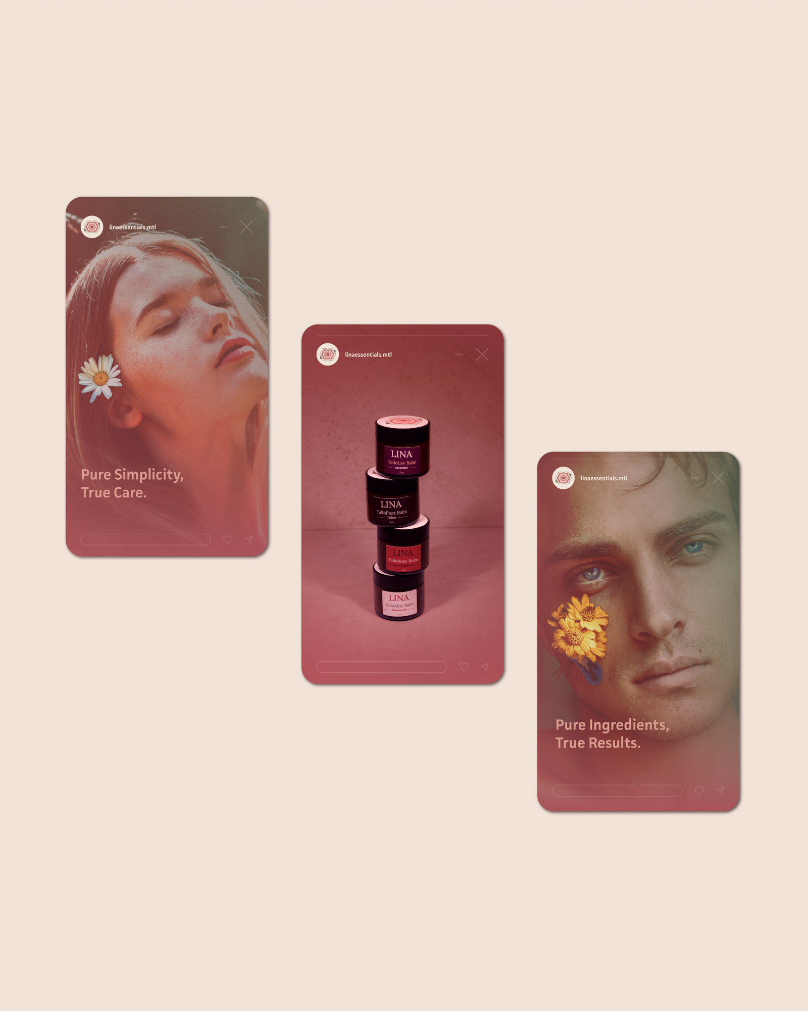
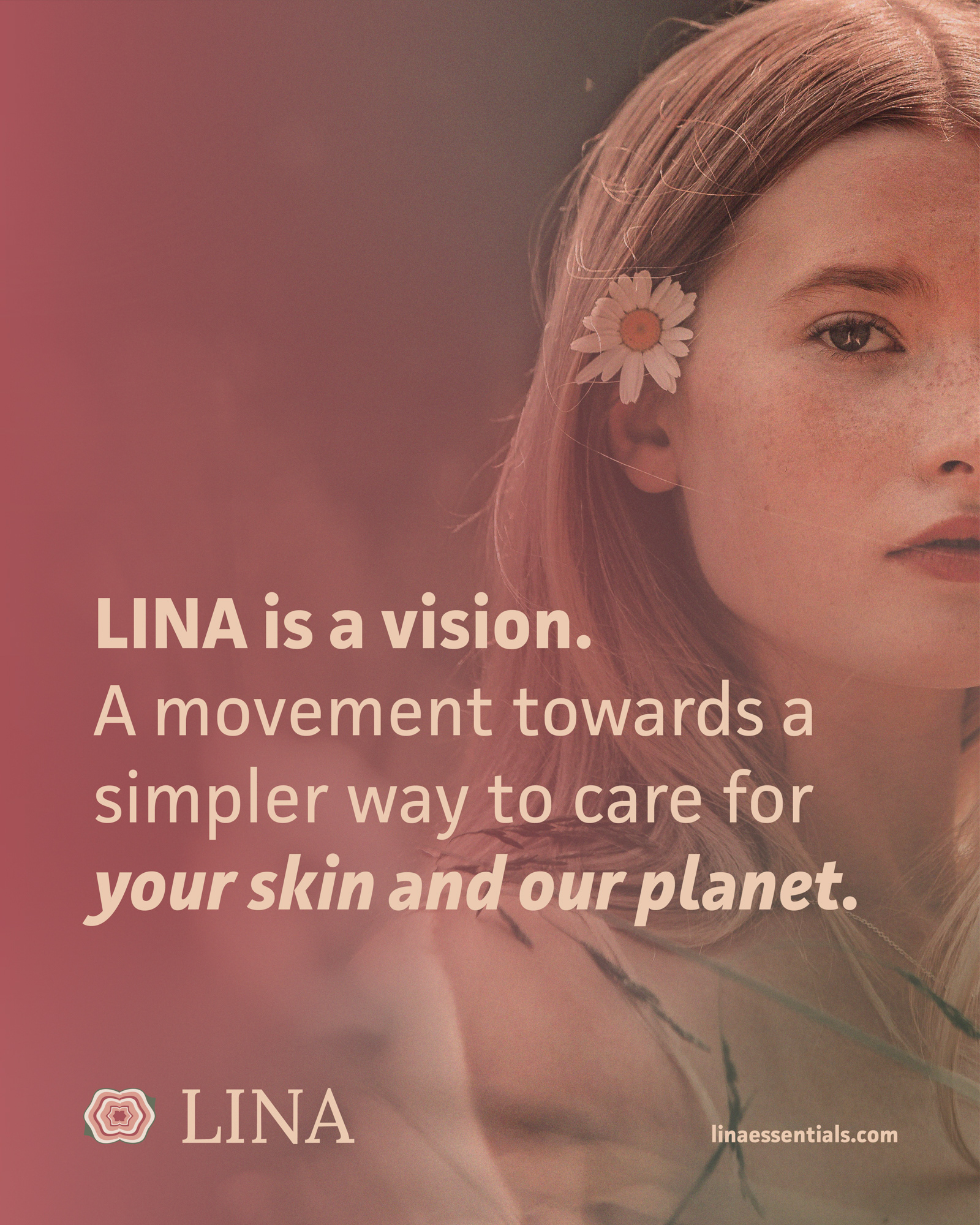
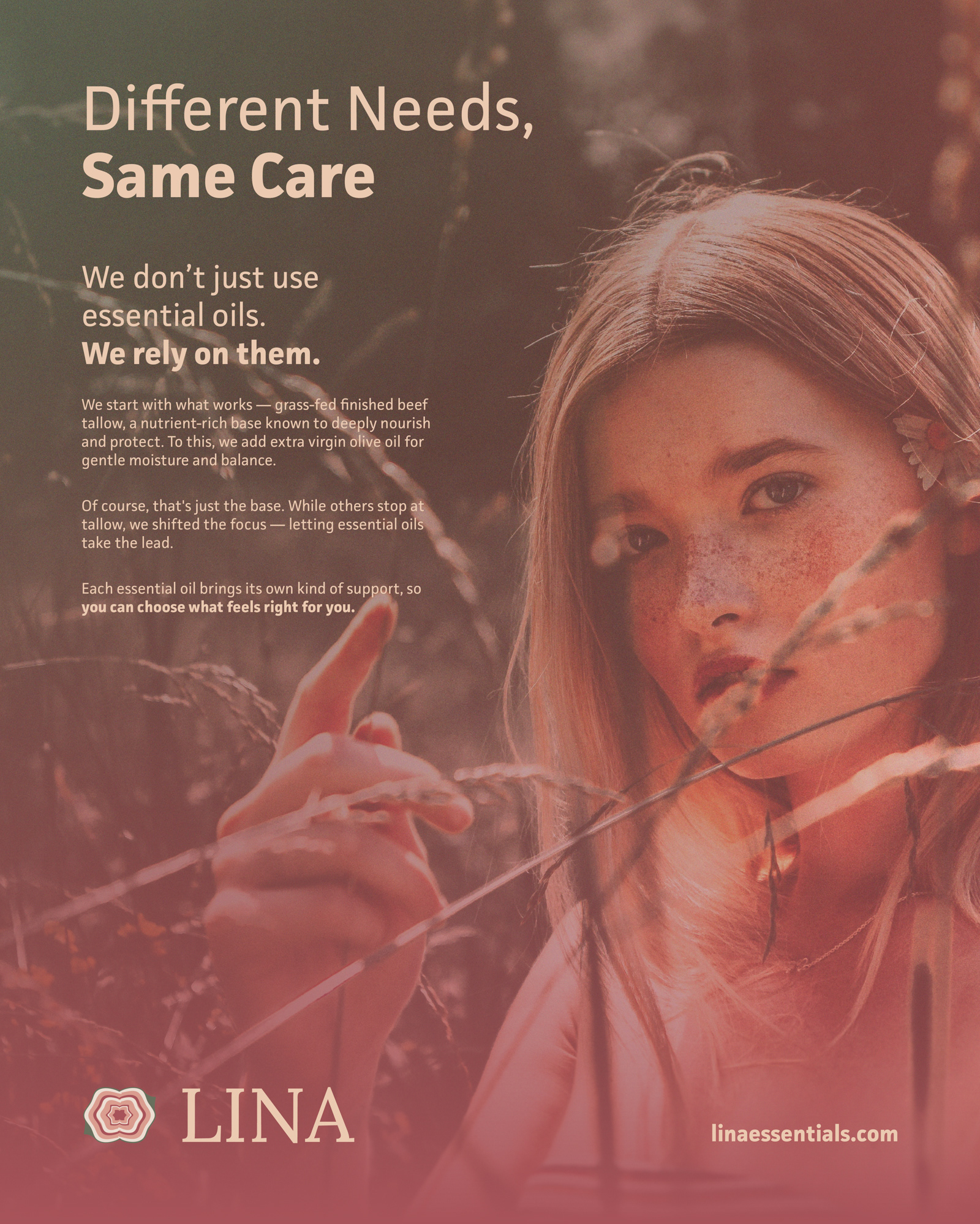
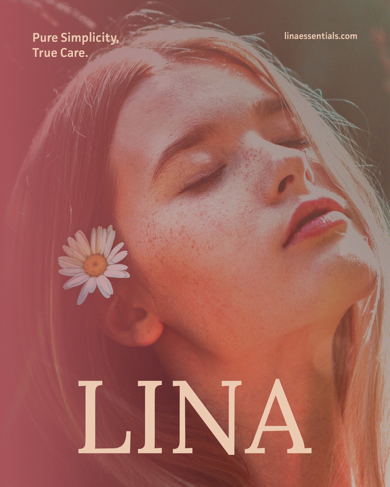
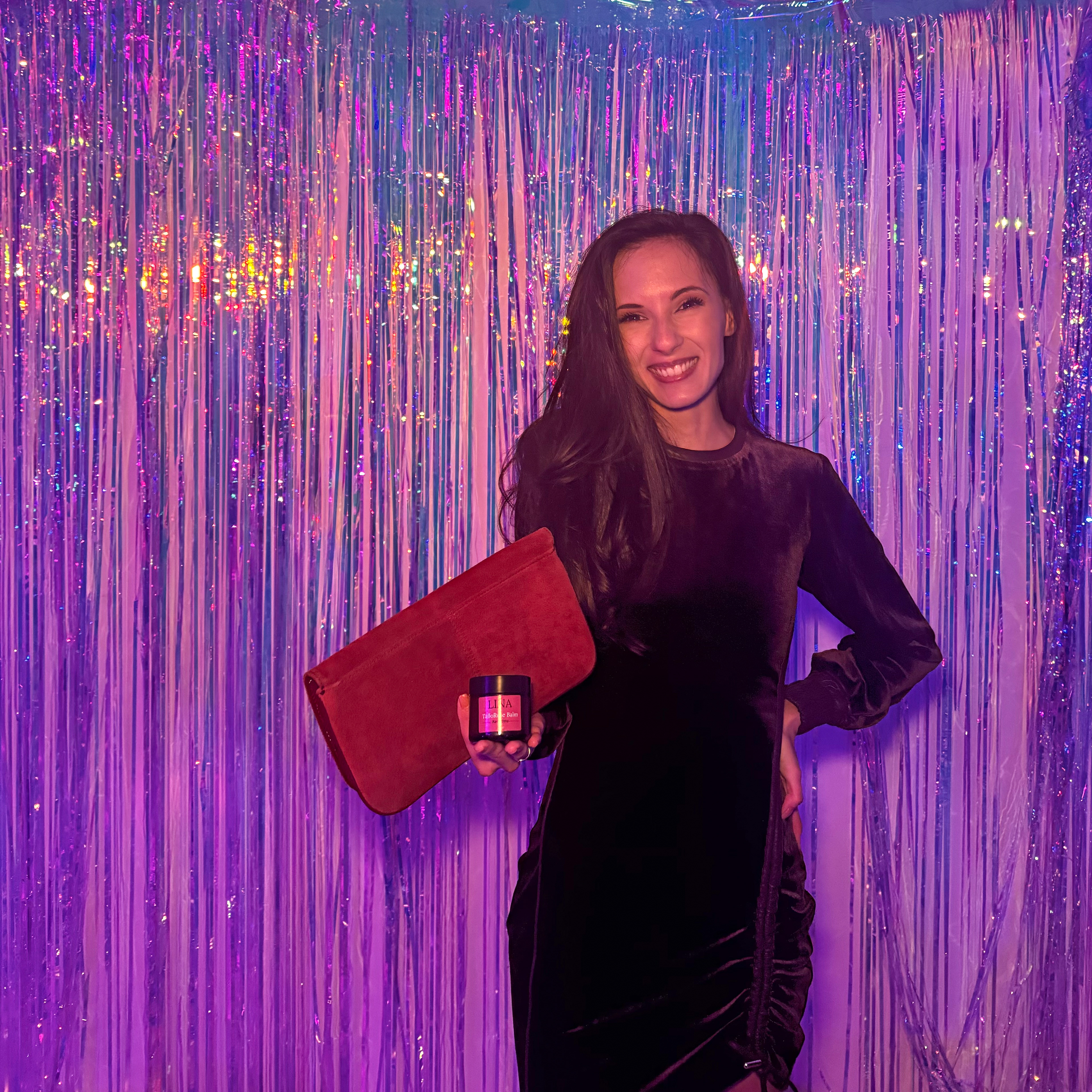
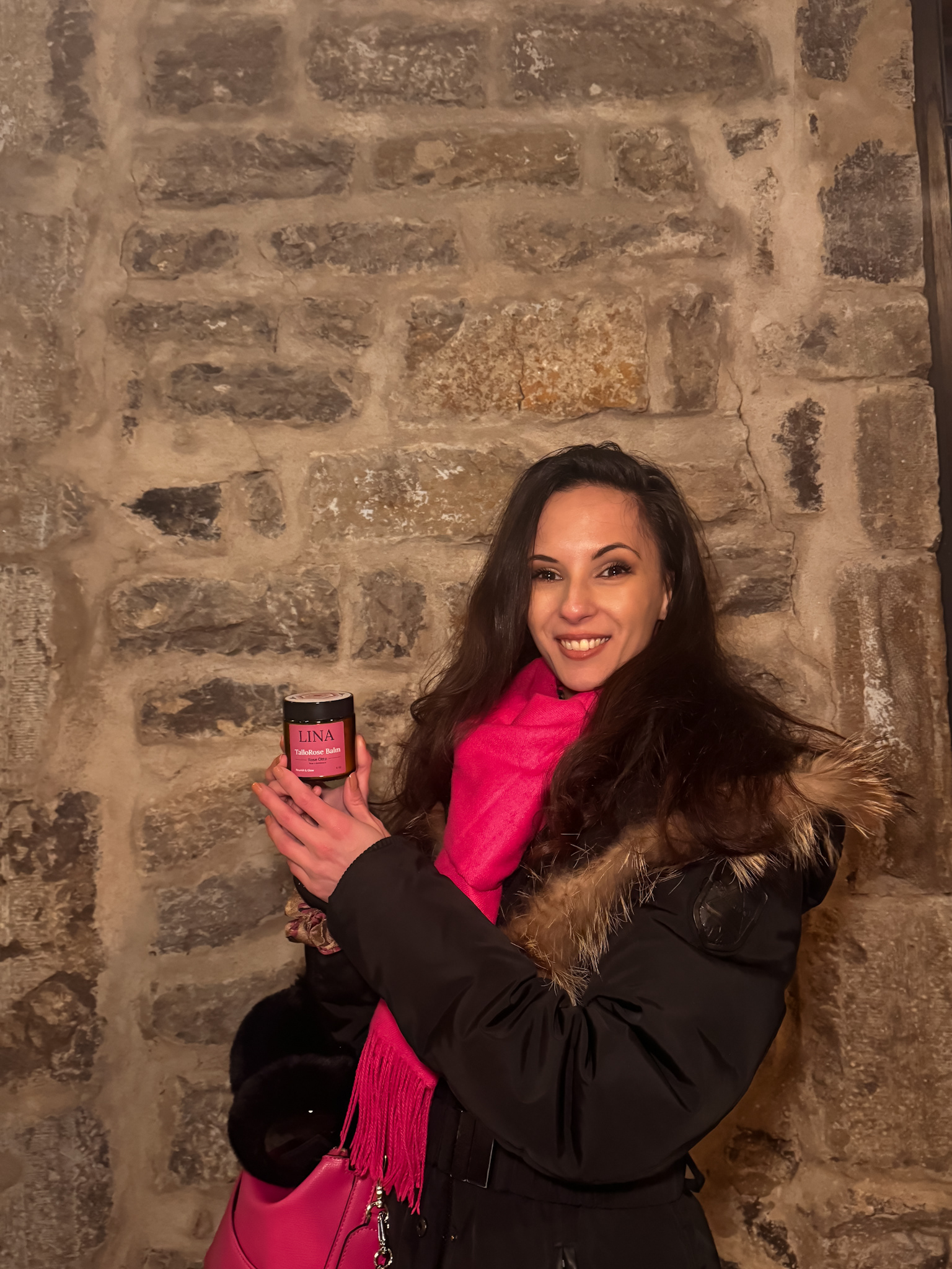
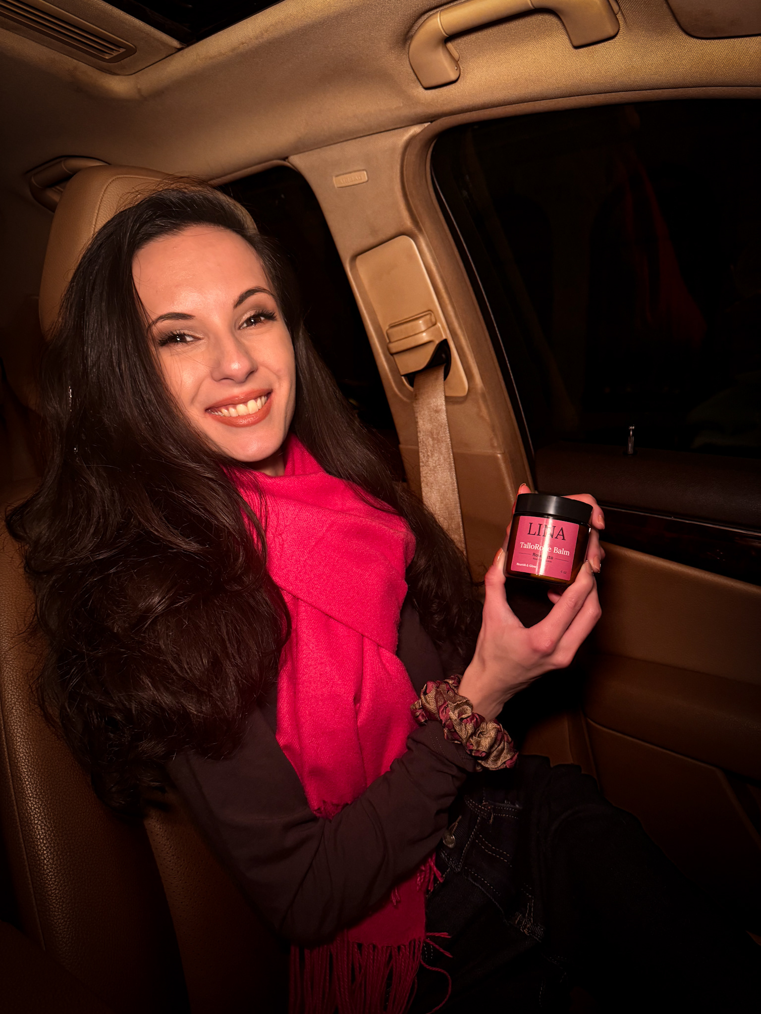
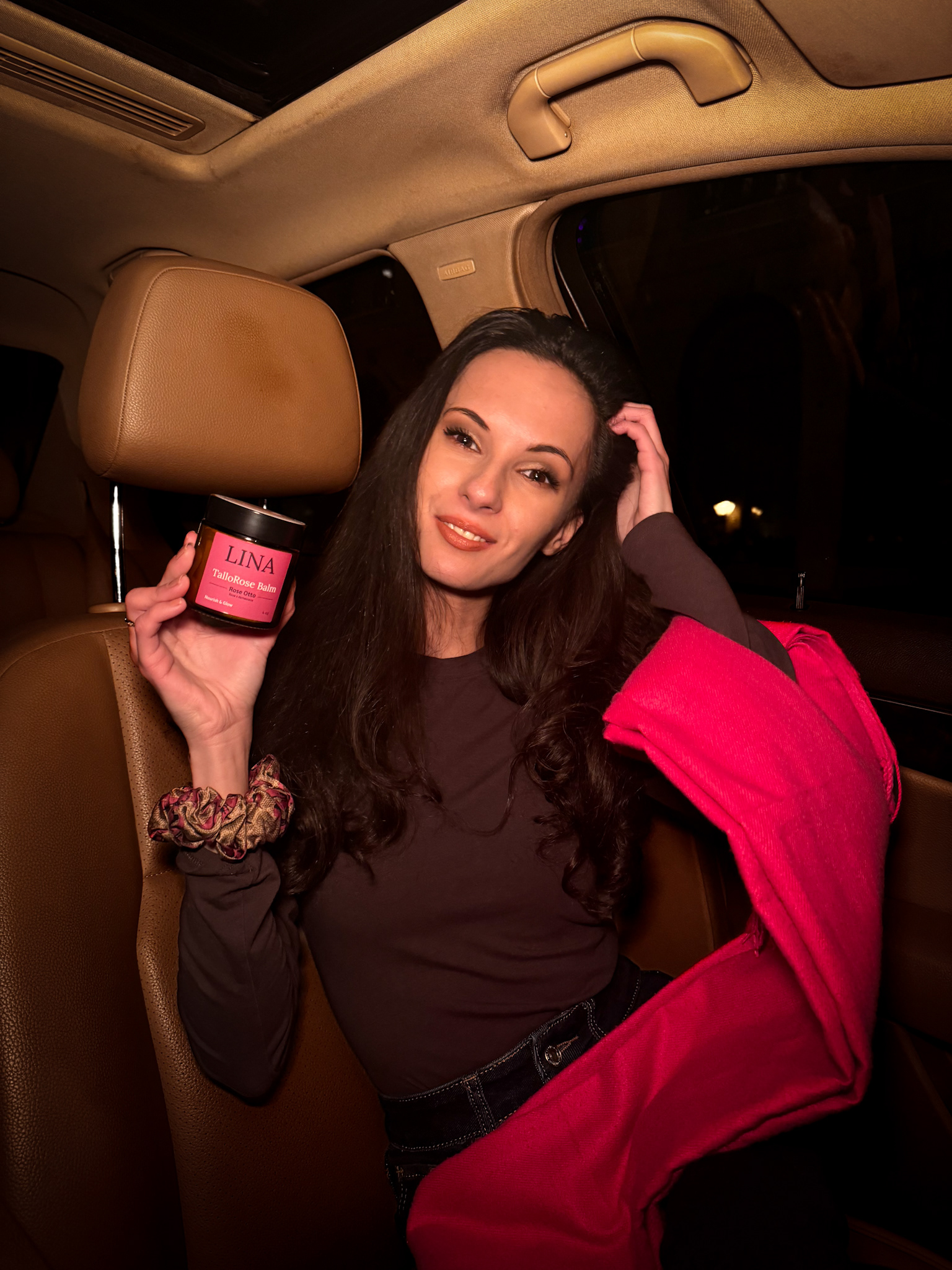
Editorial & Lifestyle Design
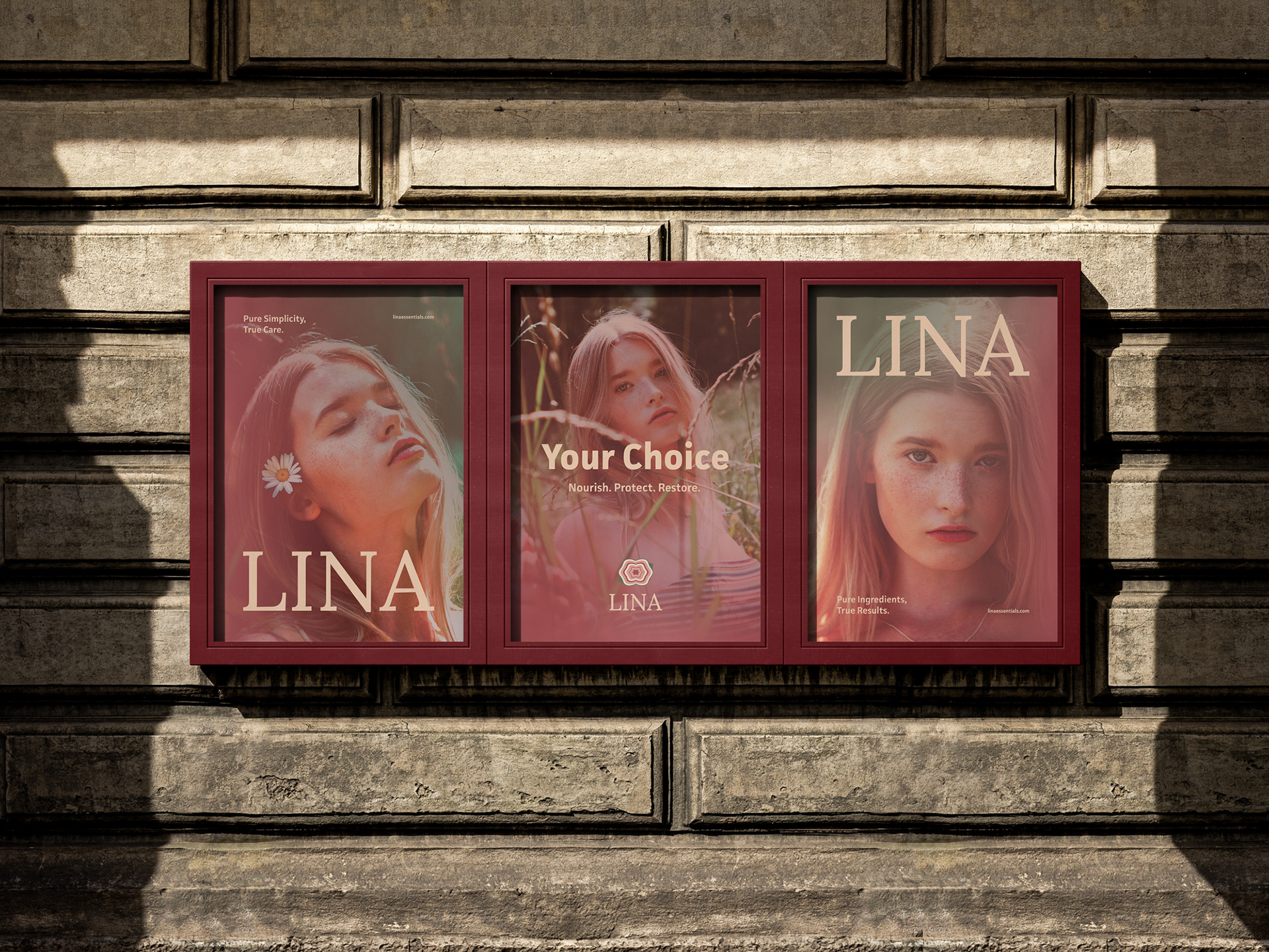
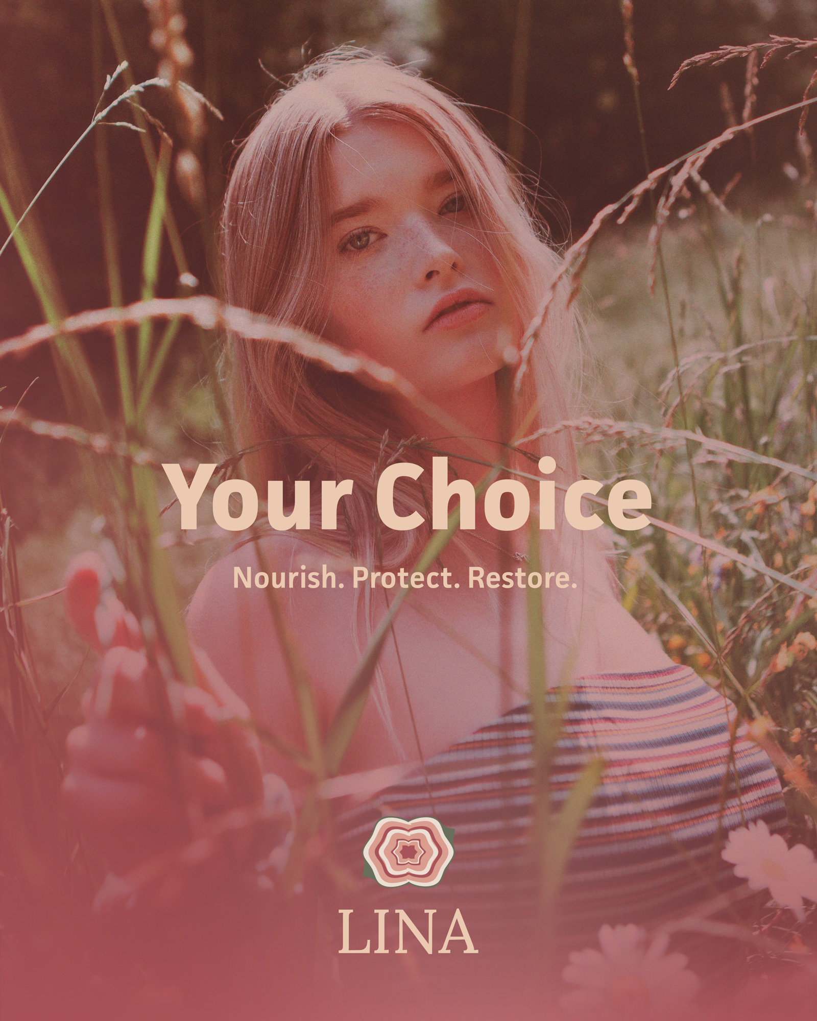
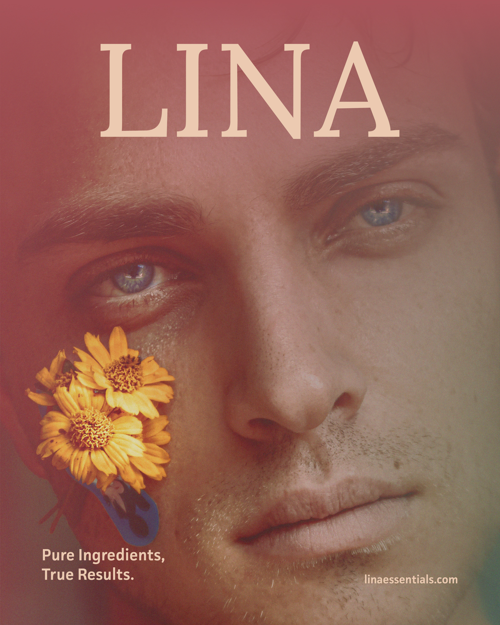
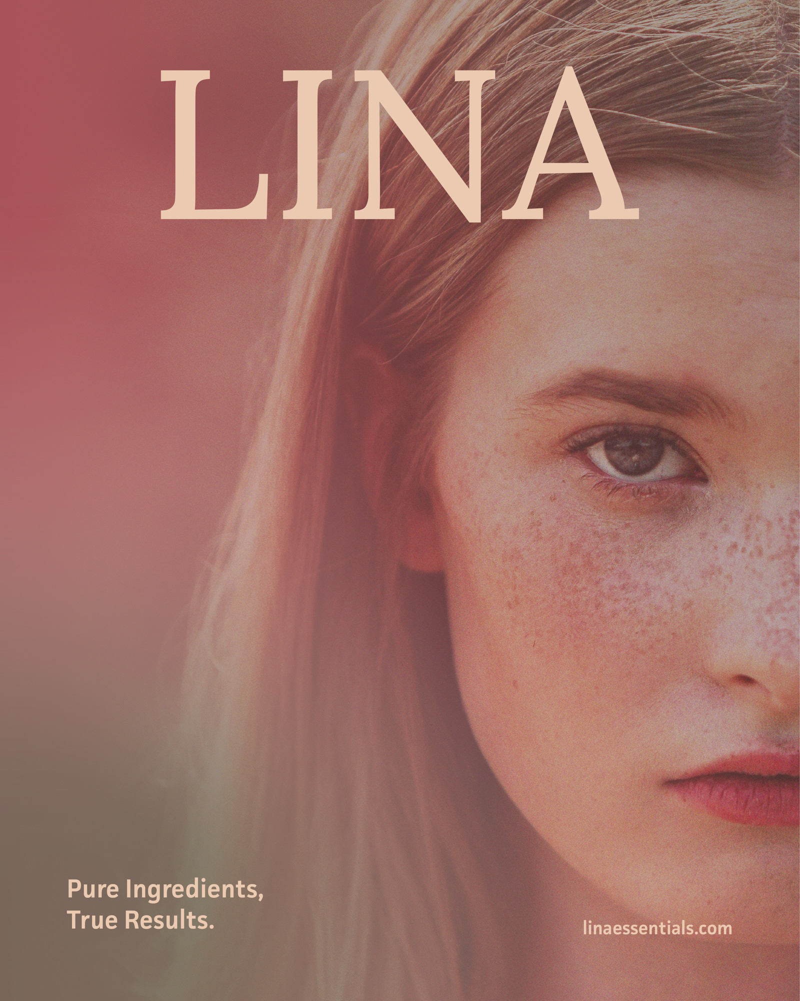
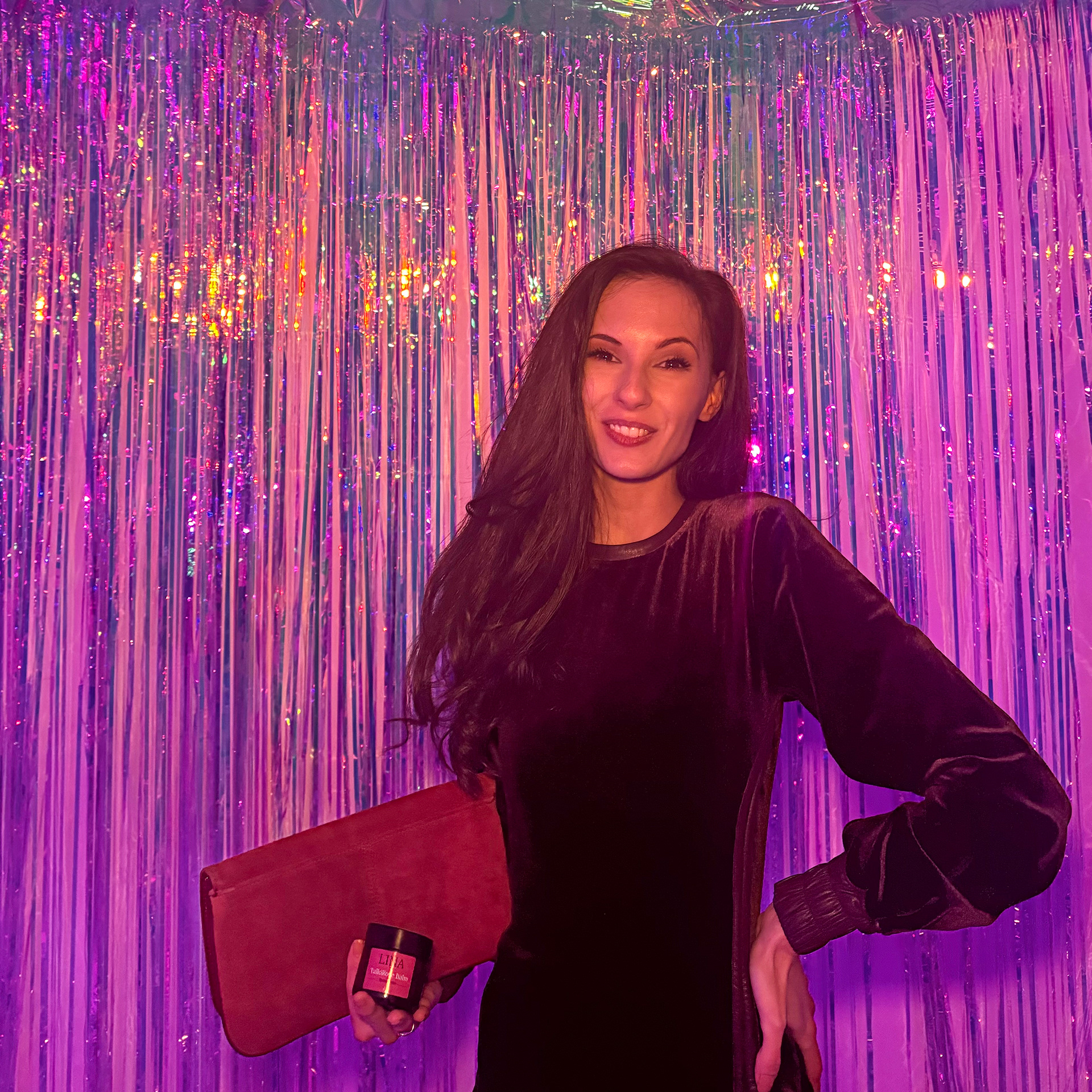
Skincare brands typically rely on close-ups of skin — faces, arms, backs. I didn't want that. It felt too familiar, too expected, and I didn't have the means to photograph models applying the balm. So I found another way: I sourced photos of one specific stock model whose look and mood aligned with LINA's visual direction, then edited every image to match the brand's palette and atmosphere. The result felt more editorial than commercial — intimate without being clinical, personal without being generic. It gave LINA a face without making the skin the product.
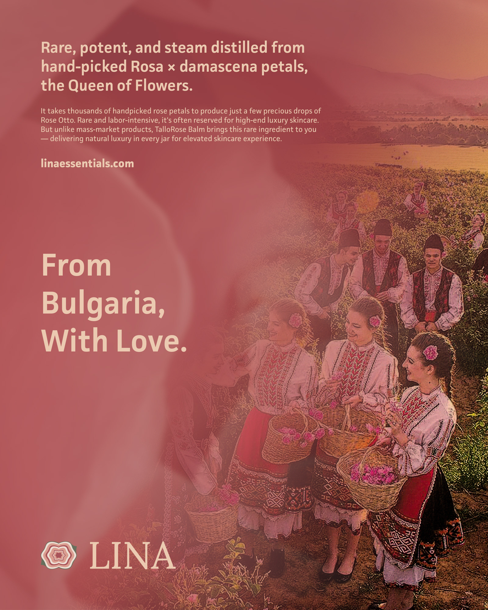
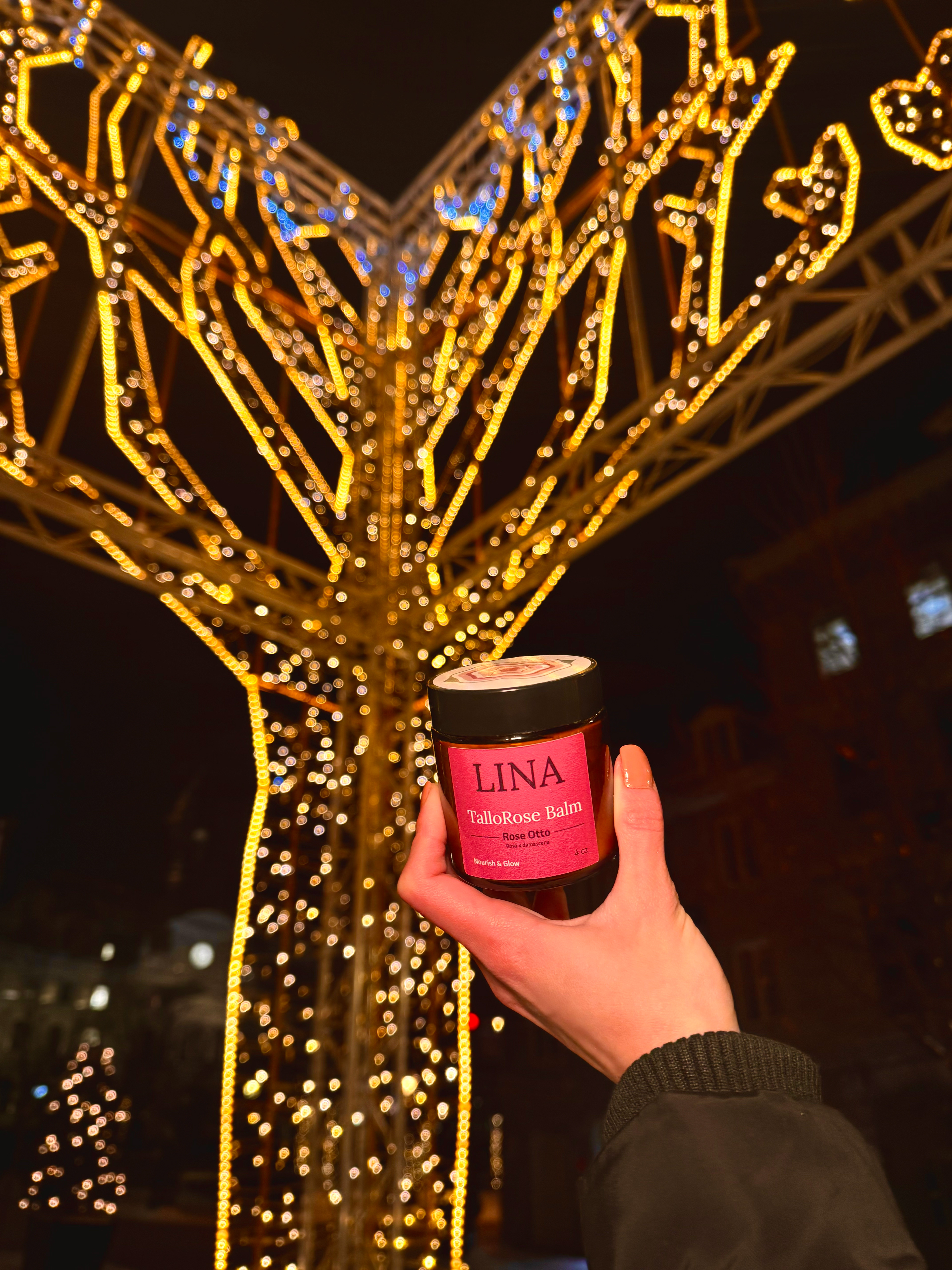
TalloRose Balm: The Hero Product
TalloRose was the product that started it all. Rose Otto from Bulgarian rosa damascena — the ingredient I couldn't find anywhere in the tallow market — became the heart of LINA's most distinctive balm.
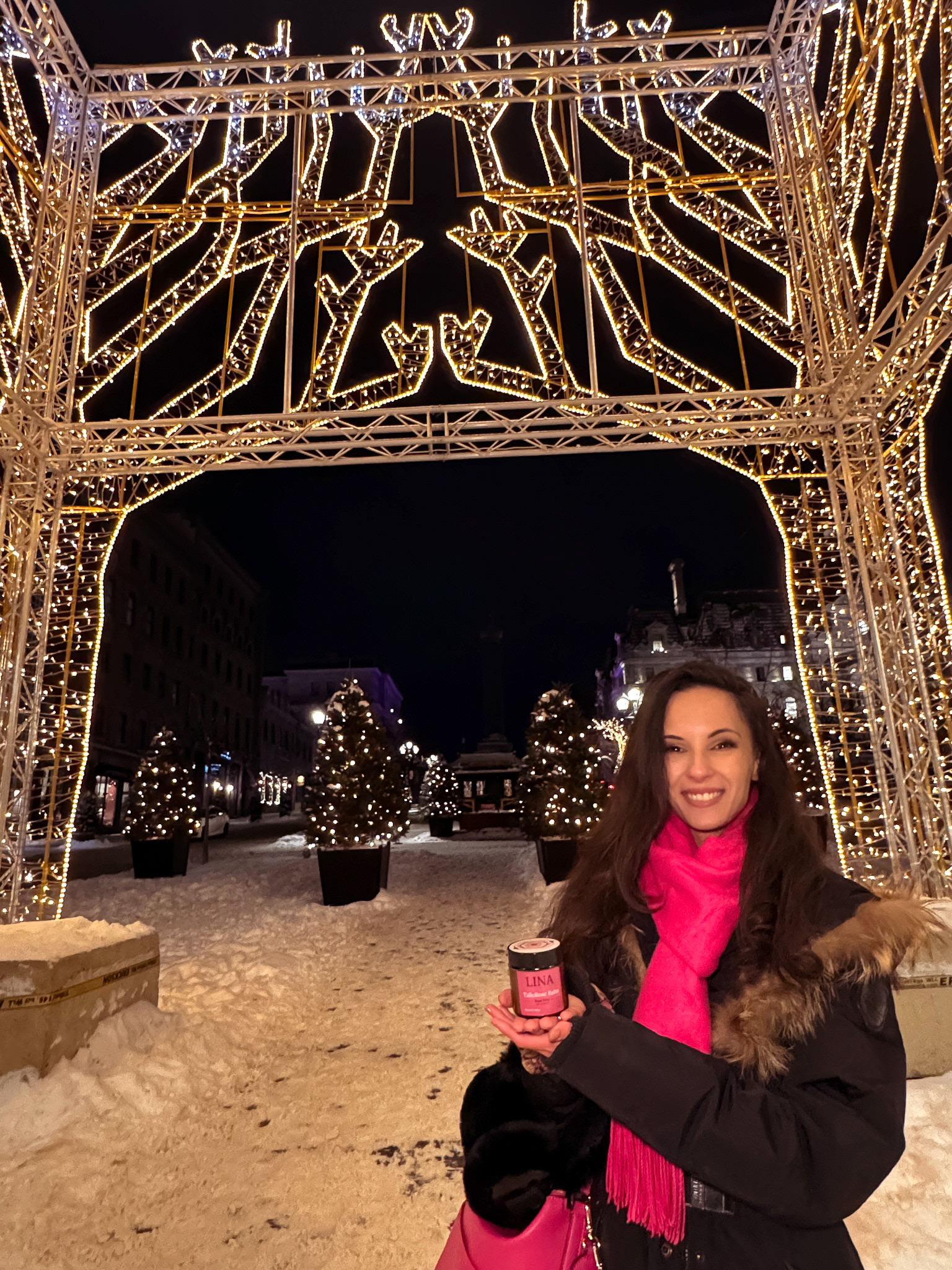
The marketing for TalloRose leaned into its origin: the rose fields of Bulgaria, the rarity of the ingredient, the personal connection behind it. "From Bulgaria, With Love" wasn't just a tagline — it was the truth.
Or stay. It wasn't all pretty. ↓
My Story Behind Lina Essentials
Design Challenges & Wins
•Labels: The labels design presented an early constraint. I wanted the labels minimal — wordmark, balm name, key ingredient, balm slogan, size. Nothing more. That left no room for product information, so I designed individual postcards for each balm, covering ingredients, benefits, and usage.
•Signature: I took a signature approach to the logo. I extracted a graphic element from the mark and used it as a recurring frame across reviews, carousels, and type-based designs — something I do intentionally to give my work a recognizable thread.
•Balms Photography: It was another challenge entirely. Shot at home with a Nikon D7200, a backdrop, and home lamps, I spent hours in post-editing to get the moody, cinematic, professional look I was after.
•Lifestyle Shots: I refused to go the typical skincare route — close-ups of skin, arms, faces with the balms. It felt too generic. Instead, I found one stock model whose look matched LINA's mood, edited every image to fit the brand palette, and built an editorial campaign around her. I didn't want LINA to look like every other skincare brand.
The Product Strategy
•I wanted LINA to feel affordable, different, and full of options other brands don't offer. So I made the balms available in two sizes — 2oz and 4oz — and two textures: whipped and solid. Four balms, two sizes, two textures — that's 16 variations from day one, which is a lot for a brand just starting out. A huge mistake. If I had 100 clients a week, I wouldn’t be able to sustain that by myself.
•I am ethical and fair person. The tallow market frustrated me in both directions. Some brands are smart and have one product, one size, one texture — and that's it. Others go the opposite way: lip balm, hand balm, legs balm, man balm, child balm — all essentially the same product with a different label. The illusion of choice: it felt like a scam to me, because tallow mostly works for everyone and everything. So why pretend otherwise?
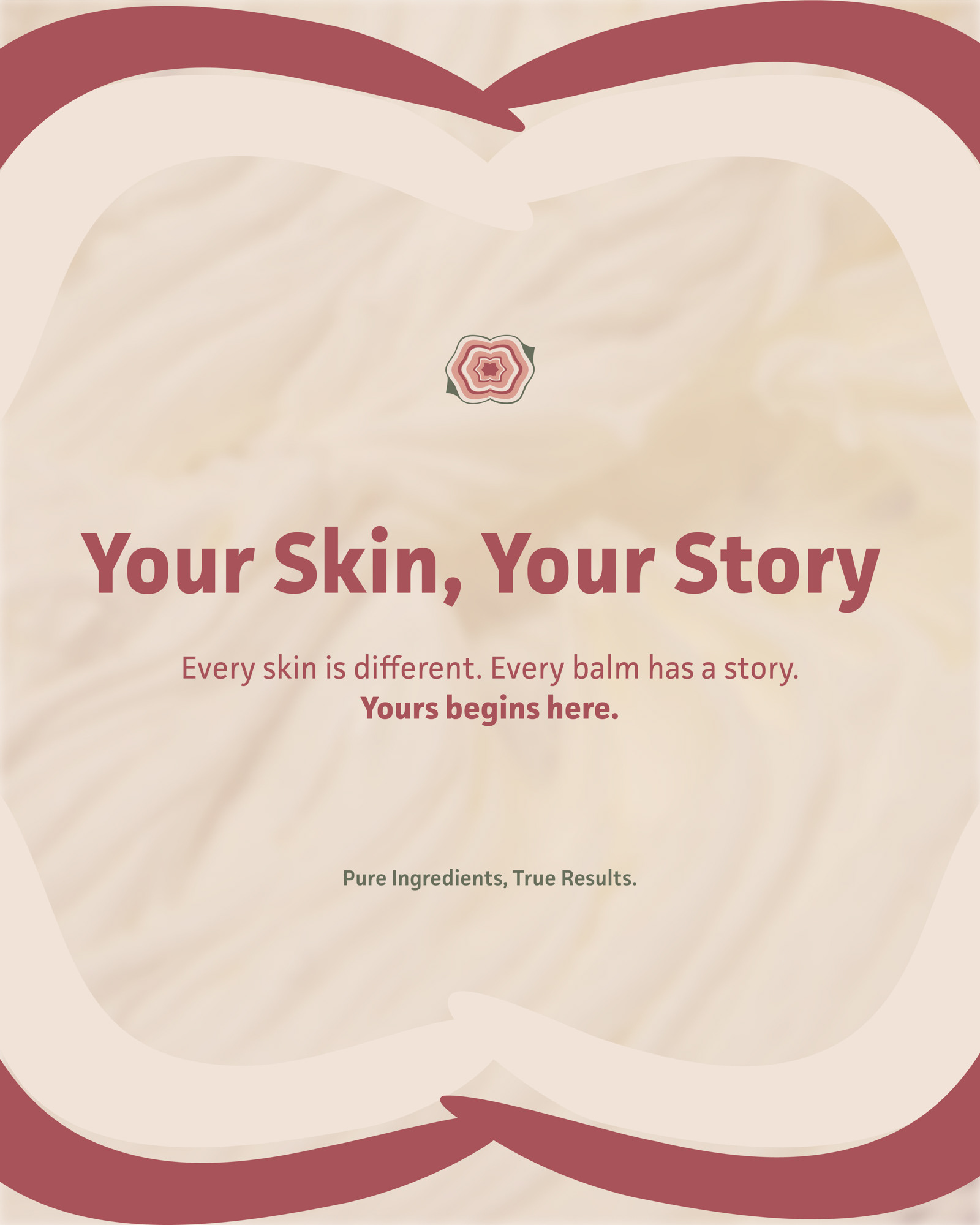
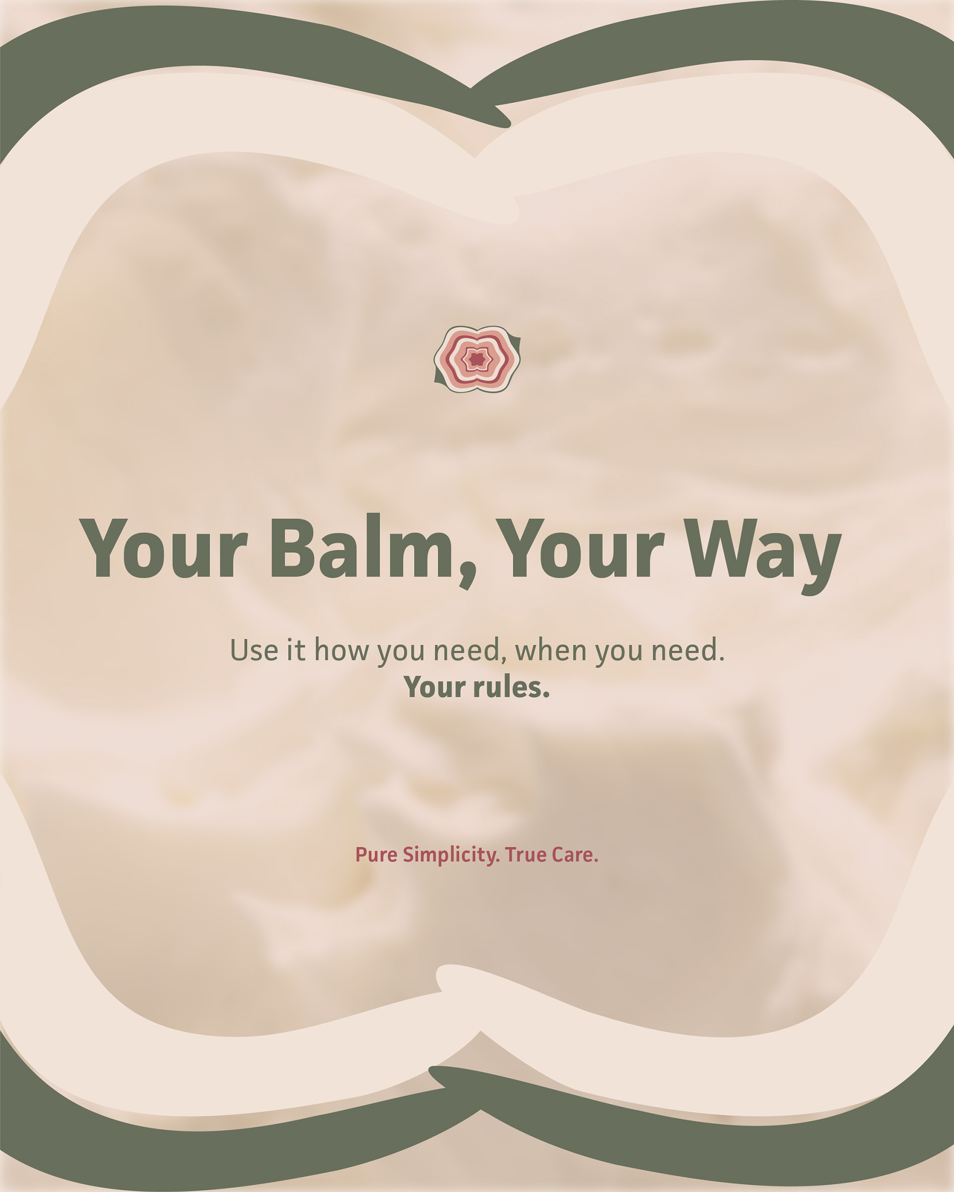
•Instead, I made the essential oils the story. Not the tallow. Everyone in this market is talking about tallow — its benefits, its origins, its fat composition. I wanted to shift the focus: one essential oil = one skin need/solution = your choice. That's where "Your Balm, Your Way", "Your Skin, Your Story", and "Your Choice" came from.
•And visually, that meant no cows, no farms, no rustic wooden spoons… I wanted to show the beautiful, aesthetic side of having a tallow balm on your nightstand.
Personal Challenges
•I am a graphic designer — not a marketer, not a social media manager, not a manufacturer, not a copywriter, not a business strategist. But when you build something alone, you become all of those things at once.
•I felt completely overwhelmed and anxious the moment I realized how many skills and fields I don’t know. You simply cannot do 20 jobs while being only one person. At some point, something suffers — and usually it's the thing you're least trained for. I didn't expect to feel my confidence take a hit. I know I'm a good designer — but once you see how much you don't know, it's hard not to feel like it's not enough.
•I also launched quietly — after nearly a year building the brand, I was so ready to be done that I skipped the hype entirely. No behind the scenes, no build-up, no slow reveal. That was a huge mistake, especially when you don’t have a huge amount of followers yourself.
•Fighting for consumer attention in a world drowning in content. You have to repeat yourself millions of times for 1% of people to actually stop and buy. I find it exhausting — the daily posts, the reels, filming myself using the product, constantly performing for an algorithm that may or may not reward you. I felt drained, annoyed, and irritated.
•I knew I needed a consistent face for the brand — but filming myself using the product and essentially preaching it out there felt uncomfortable, and honestly, I was just too shy to do it, even though I got the face.
• And then there's the bigger, more uncomfortable question: I'm a woman who wouldn't spend $50 on a jar of tallow herself. I try to stay away from the beauty and skin care industry for obvious reasons. So how do I genuinely convince someone else to? That's something I'm still sitting with.

Business Reality
• I thought launching an online store with a handmade product would be straightforward. It is not.
• Every batch of tallow takes 12 hours to prepare — just for a small quantity. It is physically tiring and time-consuming before anything else even begins.
• You need money to invest, and I barely had any. Limited resources = limited options.
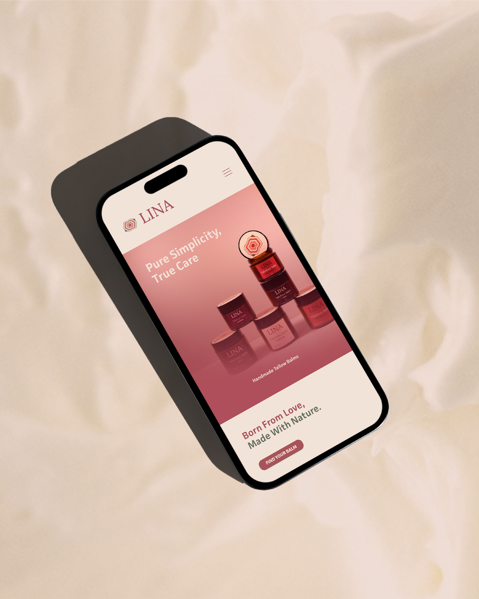
• I learned Shopify from scratch while designing the website. What took me 4–5 months I could now do in one — but that's time I didn't have when I was also designing, photographing and writing.
• The marketing side — ads, reels, animations, copywriting, brand tone, social media strategy — is a completely different world that I'm still navigating and honestly find overwhelming. And no, ChatGPT does not help properly with that. People want a genuine approach and a story.
• Right now, sales are mostly through friends and friends of friends — and I'm genuinely grateful for every single one of them. My friends and family supported me, believed in me, and helped me along the way. And that literally melted my heart.
The Designer's Irony
Besides the challenges and the struggles, I am proud of what I built. It is indeed beautiful. The people around me were genuinely impressed, and that meant a lot.
But the moment I launched, I started seeing everything I'd do differently. That's the designer's curse — you create something, you love it, and then slowly, you start to hate it. The website I want to rebuild entirely and to simplify it. I want to bring in the model campaign visuals, make it feel more cohesive with everything else I created. I used too many colors. I know it now. 2 to 3 colors are just enough.
I wanted to learn everything and redo the whole brand to make it more "perfect" — but that wasn't possible, and that tension was exhausting. A brand is an evolution, an ongoing progress. It is never a finished thing. I had to make peace with that.
The hardest part wasn't the work. It was accepting that this is just version one.